0

Color is a powerful tool. It affects mood, catches attention, and can be used to influence purchase decisions both positively and negatively. However, people don’t perceive color the same way.

Roughly 2.2 billion people around the world have a specific visual impairment that interferes with how they process colors. This makes it difficult to access or understand information portrayed by color alone.

By creating an accessible color palette that’s easy to read, you can design a website that is both aesthetically pleasing and easy to navigate for everyone.

Let’s explore how you can use website color palette accessibility to your website’s advantage. 

Why Website Color Palette Accessibility Matters

Color accessibility is about creating color palettes and combinations that are visible to people with visual impairments, like color blindness or vision loss. Designing for color accessibility means creating inclusive websites where color combinations are clear to your audience. 

This results in websites that are easier to navigate and understand, ultimately providing a superior user experience while meeting regulations.

Accessible color palettes benefit those without disabilities as well. For example, adults with age-related vision changes or those reading on low-resolution screens can benefit from an accessible color palette. Also, people who are in bright sunlight or dimly lit environments can still read content if it has the right color scheme and enough contrast.

You might hear someone ask, “Is there a universal color for accessibility?’ While there isn’t a single universal color for accessibility, black text on a white background is considered to be the easiest for people to read. However, this blog will equip you with more options than that you can create a color palette that fits your brand and serves your site users well.

1. Understand ADA Compliant Colors

Understanding ADA compliance and website colors can be tricky. Unfortunately, it’s not as simple as a checklist you can reference when building your site. The law only states that you must provide “reasonable accessibility” to people with disabilities, like the ability to use a screen reader and fill out forms.

Although it isn’t a legal standard, most developers and designers follow the Web Content Accessibility Guidelines (WCAG 2.0), which include three levels of compliance: AAA, AA, and A.

Accessibility consists of more than color, but we’re going to focus on which level your site would fall into based solely on your use of color.

WCAG Levels of Accessibility


If you’re working on a new website or a website redesign, knowing the differences of each WCAG level can help make the design process easier. 

Level AAA

This is the strictest level of compliance. Level AAA is often used by government agencies, medical providers, and organizations that receive taxpayer funding. Level AAA requires a higher contrast level of at least 7:1 for normal text and images and a 4.5:1 level for large text.

Level AA

This is the medium level of compliance. For the majority of companies, level AA provides a good balance between meeting the legal requirements for usability and still giving designers flexibility. Level AA color guidelines require normal text and images to have a minimum color contrast ratio of 4.5:1 and large text to have a contrast ratio of at least 3:1.

Level A

This is the lowest level of compliance and is not recommended in terms of color. Color combinations that fall below levels AA or AAA will be considered a “fail” by color-checking tools.

How Compliance is Determined

Your design’s level of color compliance depends on two factors: the contrast ratio between the foreground (text) and the background, as well as the point size of your text.

A contrast ratio of 7 or higher is considered AAA compliant, while 4.5 through 7 will meet AA standards.

Tower Color Contrast Checker blog Unlocking the Importance of Website Color Palette Accessibility

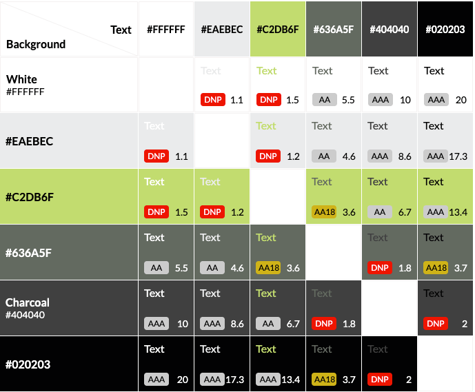
An example of a color contrast checker using Tower’s brand colors.

Some color combinations will be AA18 compliant, meaning they are readable at 18px (or 14px bolded) and above. If you do choose to use “borderline” complaint colors like these, however, you should take into account that text may scale down for mobile and no longer meet this size threshold. 

Of course, there are exceptions to every rule. If your client is using a font that’s unusually tall or narrow, you may need to find a contrast ratio even higher than the AA minimum.

If you need to redesign or update your website to be ADA-compliant, our team of designers and developers is ready to help.

2. Check Colors for Accessibility

To ensure your colors meet accessibility standards and are ADA-compliant colors, follow these simple steps:

Use a Contrast Checker Tool: Input the hex codes for text and background colors, or upload your design to a tool like:

Test Your Design: Whatever tool you use will provide a contrast ratio and indicate if your design meets WCAG guidelines.

Adjust Colors for ADA Compliance: If the ratio doesn’t meet the requirements, adjust the colors by darkening or lightening one shade until the ratio improves.

Set a Target Ratio: Aim for AA compliance (4.5:1 for normal text). For higher levels of accessibility, aim for AAA compliance (7:1).

Preview and Save: Once the colors meet the necessary ratio, preview how they look in your design and save them for future use.

3. Use These Practical Tips for Better Website Accessibility

Envision Your Audience’s Journey: Before you start designing a website, make sure it’s built with all users, including people with disabilities, in mind from the beginning. It is easier to build the website correctly the first time, envisioning all audiences, than to go back and fix each issue.

Use Colors Consistently: You’re likely using the same color palette for your entire brand, including your website. If not, you should be. Maintaining a consistent color palette across your website and social media is important for cohesive branding

Think of Colors on All Platforms: Remember that your brand colors will appear not only on your website, but they’ll also be in all your advertising, like your social media. So the contrast is as important there as it is on your website for a positive user experience.

Check Your Combinations: Anytime you change your color palette or want to try out a new combination, make sure you check the ratio first. I know—it’s a bummer to fall in love with a color pairing or palette only to find that you have very few or no combinations that are suitable for website accessibility.

Keep Learning: If you’re responsible for designing and maintaining your website, and you don’t have any outside support, keep researching and learning. Take the time to educate yourself on website accessibility beyond color contrast to help give yourself a well-rounded picture.

As a general rule to remember, organizations should design their sites to at least meet Level AA recommendations. But remember: the higher the contrast ratio of your accessible color scheme, the more accessible it is.

Sometimes, companies will hesitate to update their brand colors because it can be overwhelming and change all their work. However, that’s not always the case.

For this Tower client, minor adjustments to their existing red and black tones gave us twice the AA and AAA-compliant background and text color combinations.

A Tower client's original and updated color palettes


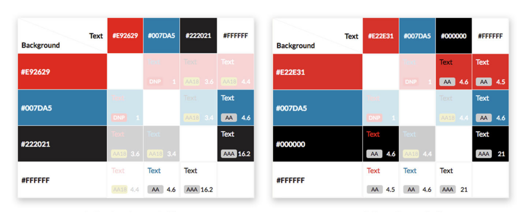
Luckily, these are minor tweaks that can make a website fully accessible. Even slight alterations to a color palette can give you more viable background and text color combinations, making for a more dynamic and engaging site.

Why We Create Stylish & Functional Designs

Designing through the new lens of accessibility can be frustrating at times, especially when working within an existing brand’s color scheme. It can be easy to get excited about a new design, but we need to remember that websites need to be both usable and beautiful.

Having an accessible color scheme might seem like a small detail, but the contrast between the text and the background on your website can significantly impact how people perceive and interact with your content. When we use accessible color palettes, it makes the Internet a more accessible place and a positive experience for everyone. At Tower, we consider visual accessibility, specifically accessible color palettes, essential for every site we build. 

If you need to redesign or update your website color palette accessibility, our team of designers and developers is ready to help.

Around-the-clock support. No wait time. Letting AI do the hard work. What’s not to love about live chat on websites? It may seem like an easy solution for an overwhelmed customer service team, but is it really beneficial to your business? We’re going to break down the advantages and disadvantages of online chat so you can decide for yourself! 

What Is Live Chat? 

Live chat on websites is a way for customers to communicate with a company representative via real-time online messaging. This can be easily installed on your site, typically as a pop-up window where users can start a chat. 

Most live chat features rely on AI to answer frequently asked questions and only give you a real person if requested. Online chat can support sales, customer service, and many other departments. 

Customer service online chat began in the late 1990s and early 2000s, but it was slow to gain popularity. Now with the rise of AI, chatbots have become much more complex. As the industry evolves, so do the advantages and disadvantages of online chat.  

Pros & Cons: The Advantages and Disadvantages of Online Chat 

While there are many benefits of having live chat on your website, it’s not all sunshine and roses. There are also significant disadvantages of live chat that need to be considered before deciding if it’s right for you. 

Live Chat Pros

#1. Real-Time Support

One of the biggest pros of online chat is that people can find answers to their questions quickly. With the boom in AI, this is even more prevalent. The instant gratification of getting an immediate response leaves your customers feeling more satisfied. According to one survey, 63% of users choose live chat as their preferred method of contacting a business. 

#2. Easier For Your Customer Service Reps

Installing a website chat software on your site lets your customer service representatives (CSRs) field more questions and juggle multiple chats at once. They also get a live preview of what the user is typing, even before they hit send. Lastly, angry complaints are much easier to handle. It is less taxing to deal with a frustrated customer over chat than it is over the phone. 

#3. Increases Conversions

If implemented and staffed correctly, live chat functions have the potential to increase conversion rates and sales for your business. When a real person walks someone through a purchase, it’s more likely they will spend money or come back a second time. 

#4. Not Disruptive

Online chat allows customers to get support without it disrupting their entire day. They don’t have to stay on the line for hours, waiting to talk to someone. They can get easy help while at work, home, or out and about. Agents can even send links, files, and other documents without needing to change communication channels. 

#5. Builds Relationships 

Live chat on websites is inherently more casual than other forms of communication. This opens the door for more personalization in agent’s responses, making it easier to build a relationship with customers. If they have a positive experience, they are more likely to come back again, increasing user engagement.  

#6. Everything Is In Writing

Another pro of online chat is that it leaves a digital paper trail. Your conversation is all documented, so you can refer back and keep the receipts if needed. With everything in writing, it is easier to understand the customer’s issue and pass it on to another member of your team without them having to repeat themselves over the phone. 

#7. Customer Feedback

Another major benefit of having live chat on your website is that most software allows the user to rate the experience as soon as it ends. This gives your team more insights into the effectiveness of your chat program. 

person types on a laptop to a chatbot

Live Chat Cons 

#1. Not Good For Every Demographic 

Gen X and Baby Boomers prefer more traditional methods of communication, such as phone or email. To them, online chat may feel impersonal. Depending on your target audience, live chat may not be the right choice for your business. 

#2. Bothersome Pop-Ups

A lot of people find the chat box pop-up window to be bothersome. Sometimes it even blocks content on a page! If the pop-up window distracts from the website or negatively impacts the user experience, it may turn people away from your site. They can often come across as intrusive and gimmicky, so be careful when installing them. 

#3. Limits to AI 

Another disadvantage of live chat is the limitations of AI. For simple FAQs, chatbots can be beneficial, but any complex questions require a real person. In fact, many people immediately skip the chatbot and request a live agent from the start. It can be frustrating and a waste of time to work with an AI that you know can’t help you. 

#4. Requires Someone to Monitor 

While the idea of passing on simple questions to an AI seems great, it’s not that easy. For online chat to be effective, someone always needs to be monitoring it so they can handle issues too involved for the bot. Users have high expectations for response time, and you don’t want to disappoint them. 

#5. Timely Set Up

A common misconception about live chat is that it’s quick and easy to set up. Unfortunately, that’s not true. To set up software that will be beneficial, you need to write automated responses for every potential question. This content should be customized to your business goals, and it can take a lot of time and effort to set those pathways up. 

#6. Can Be Costly

With the price of the software, plus the cost of having someone monitoring, online chat can become quite expensive. If it’s not driving sales for your business, it may not be worth it in the long run. 

#7. Privacy Concerns

CSRs are able to see a user’s location, what pages they’ve visited, what’s in their shopping cart, and even what they are typing in real time before they hit send. Plus if you’re sharing confidential information over chat, all this can lead to privacy concerns. 

#8. More Channels to Monitor

With the addition of live chat, your customer service team is now responsible for monitoring multiple channels. During peak hours, this can be a lot to handle, especially if they are getting many requests at once. 

Implementing Live Chat Functions 

When it’s time to implement website chat software, you first need to set it up. This process involves developing a chatbot decision tree

A decision tree maps out conversations in a logical way. Each interaction will have many “branches” and every topic the chatbot covers will need its own flow. As you can imagine, all this content really adds up! The more complex your chatbot, the more branches you’ll need—and the more helpful it will be to your customers. 

Remember: your chatbot is only as good as your decision tree. 

Some common chatbot mistakes we see: 

  1. They only provide general information that cannot answer people’s specific queries. 
  2. They take users on too long of a journey to get the answer they need. 
  3. They don’t recognize certain keywords, so they are unable to provide customers with useful responses. 
person drawing out a decision tree

Now let’s get to the set-up. 

#1. Choose and Install Your Software

There are many website chat softwares available at varying price points. The more you pay, the more options you have for customization. Our dev team will provide you with a few software options to pick from, depending on your business goals. 

Once it’s installed, be aware that it is going to affect your core web vitals. Since the script has to run on almost every page of your site, that will lead to longer page loads and an overall dip in vitals. 

#2. Customize It To Your Brand

The customization options will depend on the software you choose. In our experience, these options tend to be limited and often don’t work well. They can be finicky to implement. 

#3. Develop The Decision Tree

Creating your automated responses will take the most time. First, you need to decide what queries it must be able to answer—the most common FAQs you receive about your product or service. If you’re not sure, ask your customer service or sales team. You’ll also need to decide on a personality for the bot to match your overall brand voice. 

Next, create the flow. Guide your customers through a smooth journey from start to finish. Begin by grouping potential queries into categories and then branching out from there. Every possible response needs a branch, but remember to make it natural and conversational, not robotic.

Newer live chat features are keyword based. Make sure your system can recognize relevant keywords and answer accordingly. At the point your chatbot doesn’t know the answer (which will happen), always have the option for someone to contact a live agent.  

How to Decide If It’s Right For You 

Now that you understand the advantages and disadvantages of online chat, it’s time to decide if it’s right for you. Just like any of our customized web solutions, live chat is not for everyone. Before installing any software, ask yourself: 

What problem am I trying to solve with online chat, and do I have the resources to monitor it? 

You need to have a specific reason for wanting a chatbot, besides just jumping on the bandwagon. Be intentional and ask: What problems will it be addressing? Do you think your client base will really use it? And why do you think a chatbot is the best answer? 

Sometimes, your desire for a live chat feature points to another problem—maybe you need better site content or an updated FAQ page instead. At the end of the day, it all comes down to cost. Is it going to save you money or generate sales? Is the investment worth it? If not, it’s just going to cost you. 

Live Chat Best Practices 

With the advantages and disadvantages of online chat fresh in your mind, let’s dive into some best practices. 

  1. Always have a clear purpose for installing it. 
  2. Put the necessary resources behind it. This includes the time to set it up correctly and the manpower to monitor it. 
  3. Respond quickly—don’t make people wait. When your response time lags, people get frustrated. 
  4. Make sure the placement is not intrusive. Most people put the chat box in the bottom right corner so it won’t cover any site content. 
  5. Content loads first. Your chat software should be the last thing to load on a page, giving the website content priority.
  6. Keep it human. Even if you’re using AI, always incorporate a human touch. 
  7. Have an offline plan. Figure out a system for after hours when you don’t have an agent online.

Not sure if live chat is right for you? Get expert advice from our dev team to find a customized solution for all your website needs! 

The big countdown to GA4 is finally coming to a close, and it brings a lot of changes, which include user engagement metrics. We’ve outlined the 8 key GA4 differences you can expect, but now we’ll explore how to use the engagement metrics in Google Analytics 4 to your advantage. 

Once you become familiar with user engagement in Google Analytics 4, you’ll be able to use these metrics to better define your marketing strategies and ultimately gain an extensive understanding of your audience.

What User Engagement Metrics Should You Track?

There are a lot of metrics for you in GA4, and trying to track all of them would be very overwhelming. On the other hand, if you’re not tracking the right ones, you might become more confused about what’s successful for your company and what needs work. 

As you consider what metrics to track, you should align this with the purpose of your website and your company’s marketing goals. For example, if you’re looking to sell your products or services online, your KPIs are going to look slightly different than a company looking to provide thought leadership to its audience. 

Below, we’ll outline some of the most influential user engagement metrics you can track to know the effect of your marketing strategies. 

In appropriate sections, we’ll highlight an industry average or target range. This may vary depending on what type of industry you’re in, so you can always use Google’s benchmarking tool to find specific averages on user engagement.

a screenshot of a reports column with sessions, engaged sessions, sessions per user, users, and new users.

Users

There are three different types of users that you should be aware of in Google Analytics 4. Each is similar but tells you a slightly different story about what your audience is doing on your website. 

  • New Users. In Universal Analytics, each device counted as a new user. However, GA4 will use cross-device tracking to recognize the same user on different devices.
  • Total Users. Similar to what you’ve seen before, total users let you know the number of users that had an event on your website during a specific period of time.
  • Active Users. Active users are a new metric you can track within Google Analytics 4. These are engaged users, or someone who stayed on the page for longer than 10 seconds, had a conversion event or visited more than 2 pages on your website. Ideally, a good benchmark for active users is 60% – 70% of your total users. 

*Note that in Google Analytics 4, active users will be labeled as just “users”.

Why is this metric important for understanding user engagement? Increasing new users is a really great indicator that your brand awareness is growing. If you want to take this a step further, you can also see how many of these users are engaging with your website, viewing multiple pages, and spending more time on your site.

If you’re noticing that you have a lot of new users but not as many active users, it may be because your site needs some UX improvements so visitors are given a great first impression of your website.

Engaged Sessions

The engaged session metric will also be something new with Google Analytics 4. Just like with an active user, an engaged session is when someone spends more than 10 seconds on your site, viewed more than 2 pages, or completed a conversion. 

An additional, new metric in Google Analytics 4 is engaged sessions per user. This number can be found by dividing the number of engaged sessions by the number of total users. So, if you have 683 engaged sessions and 1,100 total users, your engaged sessions per user is 0.62, or 62%.

Just like your active users, a good benchmark for your engagement rate is anywhere between 60% – 70%

Why is this metric important? What we provided above highlights your entire website’s engagement. But you can also narrow this down to specific pages. By finding specific pages that have higher engaged sessions, you can continue to promote that product/service/insight on multiple platforms. 

On the other hand, you can find pages that aren’t performing as well and have lower engaged sessions. This could be a great indication to rework those pages, rewrite the blog, or to better promote the page across different mediums, like social media and email blasts.

Bounce Rate

Since engaged sessions are now an engagement metric in Google Analytics 4, you can use it to get a better idea of what your bounce rate percentage is. Simply inverse the percentage of engaged sessions to get your bounce rate. 

This bounce rate will tell you how many users stayed less than 10 seconds on your site. So, continuing with the example above, if the engagement rate is 62% that means that 38% of total users went to your site and then immediately left.

Average Engagement Time

This is an important metric to show you how long your active users are spending on your website. If you’re noticing that people aren’t spending a lot of time on your page, and aren’t converting, it’s likely that something needs to be adjusted. 

Again, use this metric to see where users are spending the most time on your site. If you’re noticing that your blog posts, case studies, landing pages, or other online materials are getting little engagement time, try creating evergreen, engaging, and authentic content.

Events

Now the main difference you’ll see in UA vs GA4 engagement metrics is it’s now tracking events rather than goals. Ultimately, this is going to help you see a more well-rounded view of your users and their engagement. 

An event now includes any activity on your website, from a form being filled out to a user viewing one of your pages. This is where it is essential to analyze what you want to know about user activity on your website. 

Make sure the events you are tracking are the most important for measuring your marketing strategies. So, if you’re an eCommerce website, you probably want to be tracking when users are browsing the inventory, adding products to their carts, and eventually checking out. 

If your website’s main objective is to disperse information and show yourself as an industry expert, you should be tracking events that occur on your blog posts or case study pages. Events like page scroll depth, video progress (if relevant), and clicks.

a screenshot of conversion examples in Google Analytics 4.

Conversions

In Universal Analytics, you had to set up goals that would then track your conversions. It’s going to look a bit different in Google Analytics 4. All goals have turned into events, and you can mark your most important events as conversions. 

Simply toggle the switch to indicate which events you’d like to mark as conversions. We recommend marking events like form submissions and phone calls as conversions.

two events that are showing they can be marked as conversions in Google Analytics 4.

Why is this metric important? No matter the purpose of your website, you’re going to want users to take action. Conversions are one of the best ways to track user engagement in Google Analytics 4. 

Not only can you see specific actions being taken, but you can see where these conversions are coming from. You may see conversions come from an email campaign you sent out, a social advertisement, or a pay-per-click campaign. 

Especially during a time when you need to reevaluate your strategies, being able to see where conversions are happening can help you focus your attention on those specific channels. 

How to Improve Engagement Metrics in Google Analytics

With a little time, specific tools, and website testing, you can make changes that will benefit users navigating your site. 

Explore the Why

In marketing, there isn’t usually a one-size-fits-all answer as to why things are happening. Here are a few tips you can explore to gain a more accurate depiction of ways to improve your engagement metrics. 

Depending on your industry, there could be multiple reasons for a decrease in engagement. If you work in an economically dependent industry, this could play a huge factor in site engagement. 

There will be similar effects if your business has a seasonality factor. If that’s the case, try comparing year-over-year data rather than month-over-month, so you can get a better view of what’s happening through each season of the year. 

If you are seeing dips in engagement, don’t panic! What’s important is that you’re continuing your strategies and creating engaging, evergreen content that can be used across multiple platforms to engage more of your audience.

Encourage Engagement Across Multiple Channels

It’s important to reach your audience where they are. Cross-promotions allow for your message to spread to a wider audience, nudging them to visit your site and discover your content. 

You can use various internet marketing tactics like content writing, email newsletters, social media advertising, and pay-per-click advertising to capture your user’s attention and send them to your website.

Test Your Theories

As we said, there sometimes isn’t a definitive answer to why engagement is increasing or decreasing. So, it’s never a bad idea to test what you think may be the reason for the fluctuation or try implementing a new strategy. 

When you’re A/B testing, make sure you’re not changing everything at once. You should only change one element at a time, so you can accurately identify the most positive effects on your user engagement in Google Analytics 4.

Need help analyzing your current strategies and pinpointing areas of improvement on your website? Contact our specialists today!

This blog was originally published on September 25, 2019, and updated on June 28, 2023.

Successful businesses put a high priority on enforcing their brand standards—and rightfully so. It’s a visual representation of the relationship they have with their customers, and they maintain that rapport by always using the same fonts, colors, logo, and image styling.

That’s why it can be so jarring when you begin crafting an email marketing strategy for your client only to realize you’re limited to web-safe fonts, can’t easily overlay words on images, and can’t control the exact appearance of text because padding or margins vary by inbox.

Because of this, you may be tempted to create an image-only template so your email always looks exactly the way you want it to. Unfortunately, this is a short-sighted strategy that is likely to cause more problems than it solves. Keep reading to learn why (and what you should be doing instead).

Why You Should Avoid Image-Only Emails

Sadly, the benefits of image-only emails do not outweigh the drawbacks. Below are just a few of the reasons you should be avoiding them.

They Can Cause Deliverability Issues

When it comes to crafting your email campaigns, your top priority should always be deliverability. Image-only emails are often sent straight to the spam folder because they can be a tactic used by scammers to circumvent text filters put in place to detect offensive or deceptive wording.

The overall file size of your email also affects deliverability, as shown in this email on acid article, and image-only emails are much larger than HTML emails.

They May Be Slow to Load—or Not Appear at All

Some email clients may have images turned off by default for security reasons or to protect users from potentially offensive content or malware. If you’ve created an image-only email, they may see nothing but a wall of broken image icons, like the examples shown in this litmus article about image blocking.

Image-heavy emails can also greatly increase the amount of time it takes for the email to load, which can be detrimental to user engagement. People spend an average of 10-13 seconds reading an individual email; this means if there’s any lag time while images load, the already narrow window of opportunity you have to get your message across will shrink even further.

They Compromise Accessibility

Visually impaired people will have a much more difficult time using a screen reading device to interpret an image-only email. Although images in an email should always have descriptive alt text relevant to the email content, they are not meant to replace the email text entirely.

Two elderly women sit next to each other and use tablets.

They Aren’t Optimized for Mobile

If you design an image-only email for desktop, your customer will be squinting to see it on their mobile device. On the other hand, if you design it for readability on phones, it will look cartoonishly large on a computer screen.

The same responsive design is shown on a laptop screen, phone, and tablet.

They Aren’t as Searchable as HTML Emails

If you send an email with information a contact wants to reference later, like a coupon or upcoming event, they will have a harder time searching their inbox for your message if all the text is image based.

Now that you’re aware of all the reasons why you shouldn’t create image-only emails, here are some best practices to keep in mind when crafting beautiful and effective HTML emails.

Best Practices for Creating HTML Emails

Does this mean you should avoid having images in your emails? Not at all! Most resources suggest a 60/40 text-to-image ratio for the best balance of deliverability and an optimal user experience. Try these strategies for creating emails that make an impact with or without images showing.

Reduce the Size of Your Images as Much as Possible

You can—and should—still include images in your email, but their file size should be minimized before adding them to your email template.

To export your images for an email from Photoshop, select File > Export > Save for Web. For opaque images like photographs, the JPEG file format will allow for a smaller file size than PNG. For illustrated images like logos that require transparency, PNG is the ideal option.

If you don’t have access to Photoshop, a free online image compression tool like tinypng can help keep your image sizes to a minimum.

Use Live Text

In the majority of cases, all email wording should be HTML text that can be selected with a cursor and read by a screen reading device. Although the original list of web-safe fonts are your safest choice, some inboxes may display your font (for example, Gmail will show Google Fonts).

You can always opt to use your brand font first with web-safe fonts as a fallback. By using commas in CSS, you are telling the inbox to use the first font if possible, then the second if possible, and finally any other sans-serif font if the other two aren’t available.

<style=”font-family: ‘KoHo’, Arial, sans-serif”>

Create Bulletproof Buttons

A bulletproof button is any email button created using HTML instead of an image. They can be made using several methods including padding, borders, or Vector Markup Language (VML).

This bulletproof email button creator can help you easily create a stylized button that will display beautifully in most inboxes, including Outlook.

Swap Images for Gifs for Maximum Impact

You may be surprised to learn that an animated gif can be even smaller in file size than a photograph. It all comes down to the complexity of the image and how many pixels change between frames.

This article provides several detailed strategies for creating reasonably sized gifs for your emails. Some of these tips include:

  • Cutting instead of fading for transitions
  • Using illustrated vector elements instead of photos
  • Using an overlay to limit the color palette

Include a “View in Browser” Link at the Top of Your Email

Some users will prefer to have images turned off by default, or they may not be able to control this feature because they have a workplace inbox with built-in security features.

This is why it’s always a good idea to include a “view in browser” link at the top of your email so the contact can see the email as it was originally designed.

Use Text Elements Instead of Image Icons

Experiment with text-based/CSS elements in place of images when possible. For example, instead of creating an image of an arrow, see if there is a web-safe font that includes one. You can google “ASCII” or “Unicode” followed by your keyword to check. This chart shows all the symbols you may not have known were part of the Arial font family.

Make Images an Optional Accent Element

A recent trend we’ve noticed is emails that use images to blend seamlessly into solid-colored backgrounds. This gives the illusion of an image-only email while retaining the HTML text and responsive design for desktop and mobile.

An example screenshot of an email that blends HTML text seamlessly into an image.

Although you may not have the option of your ideal fonts and layout, a well designed HTML email is still a highly effective marketing tool that can be used to reach every one of your patrons—regardless of their demographic group or physical capabilities.

Do you need help creating artfully optimized email templates? Our email marketing team is ready to assist you in creating the best possible inbox experience for your customers.

Your website is often a user’s first impression of your brand, so you have to make a statement. But what makes a website stand out? These days, making a website attract attention is more than just ensuring it looks good. It must be easy to use, interactive, and informative. 

If you’re looking at your website analytics and noticing a lot of users are coming to your site and immediately leaving (a high bounce rate) then it might be time to make some UX improvements.

What is UX?

UX stands for the user experience within your digital space and encompasses a lot of disciplines that may be overwhelming to think about. But we are here to simplify and explain what goes into a user’s experience. By definition, UX is how the user thinks, feels, and interacts with your product, or in this case your website.

When a user comes to your site, they may evaluate in 1 of 4 ways, which are defined below. Your website should give the user value, be easy to navigate and be enjoyable to use. To help characterize your UX, ask yourself the following questions: 

Value: Is my site producing value for the user? 

Functionality: Does my site have a lot of page errors? 

Usability: Is my site easy to navigate and interact with? 

Impression: When a user first visits my site, what are they thinking? What immediate actions are they taking?

Difference between UX and UI

The terms “user experience” (UX) and “user interface” (UI) are often used interchangeably, even though they are describing two related but different things. The UI of a website consists of all the elements a user interacts with, buttons, slides, menus, maps, etc., or the relationship between the users and the computer systems and software. 

On the other hand, the user experience, as the name suggests, encompasses the entire experience of the website. UX takes into account how a user interacts with not just UI elements, but every other aspect of the website — load times, color usage, whitespace, mood, and subject matter in imagery, and even down to the amount of scrolling required to view elements on a page. 

When looking to improve your website user experience, think about the big picture. 

Why UX matters for your business

You may think that UX is something that will just help your website look better, but incorporating user-friendly features into your website design will also increase sales, and if applicable, products sold. If you are successful in improving your user experience, your bounce rate should also decrease. 

When a user visits your site, you don’t want them to move on from your site because they are frustrated when they can’t find answers on your site. Your ultimate goal in improving your website user experience is to grab your user’s attention and convert them into customers. 

A website that is aesthetically pleasing is one thing, but you also want a site that is easy to navigate, has limited page errors and motivates users to interact with your company. Creating a site with great UX allows users to trust your brand’s quality and credibility. 

Google Core Web Vitals

There are three Google Core Web Vitals that help determine a website’s user experience. These are the Largest Contentful Paint, First Input Delay, and Cumulative Layout Shifts. These Core Web Vitals will assess all aspects of the user experience and help give you an industry standard. 

We’ve outlined some of our best practices on how to improve user experience on your website that help generate traffic, keep users engaged, and allow users to easily reach their goals on your site. These practices are best paired with a strategic design team that creates content for your user. 

Keeping up with the Best Design Practices

1. Clear Call to Actions

What do you want your users to do while they are on your site? Answering this question will give you call-to-action ideas to incorporate into your site. The RICE marketing strategy will help you determine what types of call-to-action, or CTAs, to include on individual pages.  

If you are looking to interact with users that may not be quite ready to purchase your product or service, try adding soft call-to-actions on your website pages. Soft CTAs are not directing users to perform your main desired actions. Some soft call-to-actions ideas include: 

  • “Join our Mailing List” 
  • “Read Some Customer Testimonials” 
  • “Learn More” 

On some web pages, your goal should be to convert the user to a customer. This stage of the RICE marketing strategy calls for hard CTAs, which motivate a user to perform an end goal, for example, purchasing the product or service. 

2. Internal Linking

When laying out internal linking strategies, be conscious of the path you want the user to take throughout your site. Including internal linking allows website visitors to stay engaged on your site and easily learn more about your product or service.  

3. Take Advantage of White Space

Whitespace web design is crucial for users to be able to digest and understand the content on your website. Having a website that is cluttered with information, graphics, visuals, and other various content will cause users to feel overwhelmed and confused

Whitespace creates a visual break for the user’s eyes. When a user visits your site, you want them to see a clean, polished look that is easy to comprehend. 

Your whitespace web design can include more space between each body of content, margins on either side of the page, and group-related topics with white space. Remember, white space does not mean it needs to be white, the background color of your website can align with your branding colors. 

4. Write to Your Target Personas 

One of the best ways to improve your user experience on your website is to design your website for the user. What needs and pain points will your website solve for the user? Who will be visiting your site? 

Don’t be afraid to ask users questions or have them rate their experience. This feedback will help you shape your website to what works best for your target audience. 

5. Images

Images should enhance the copy and design of your website, not make the site disorganized or overwhelming. When thinking about what visuals to include on your webpage, find ones that explain the copy, evoke emotion, and talk to your audience. Avoid using images to just “fill space.”

6. Metadata 

Metadata may not be the most obvious practice to think about when looking for UX improvements, but having the correct metadata in place will help users find your website. There are a few different types of metadata, including descriptive, administrative, and structural

Your Google snippet will encompass the title tag and meta description, which is the first thing users see if your webpage shows up on their Google search. We recommend a title tag of fewer than 60 characters and a meta description of fewer than 160 characters. 

7. Mobile UX Design 

The UX improvements above are all very important to consider for your next website redesign, but if your site does not perform well through mobile, you’ll lose a lot of your potential audience. 

Key takeaways for mobile UX design are to make everything “thumb-friendly” as users will not have the accuracy of a mouse. Larger UI elements will ease the navigation and interaction points of your mobile website.  

Additionally,  remember that everything will be stacked so the content will appear much longer, requiring additional scrolling on mobile. We recommend keeping paragraphs to a maximum of three lines, so readers are able to digest the content fully without being overwhelmed. 

Mobile UX design is significant because it contributes to your Core Web Vital score. It will assess the accessibility of links, content readability, and other page elements. 

Two people looking at a screen with different mobile designs options

The Role of a UX Designer

The UX Designer will work with user research, front-end design, information architecture, and usability testing to increase your website’s user experience. They’ll help you make your website easier to navigate and interact with, so users are more likely to revisit and engage with your site. 

UX Audits

The UX audit is the first step in identifying any shortcomings on an existing site. The marketing team will comb the entire site, examining not only the UI but the overall user experience. This is to ensure the UX is serving the ultimate goal of the website. During this process, any user pain points or site goal misalignment will be identified and remediation will be suggested to ensure UX improvements across the site.

Ready to boost traffic and engage more users on your site through UX improvements? Work with our experienced web development team to set your site apart!

With 50,000+ free and paid WordPress plugins available, it can be time-consuming and overwhelming to choose the best ones for your website. There’s a plugin for every need or problem, but this wealth of options can complicate your decision-making, especially if you don’t have web development experience. 

If you’re asking yourself, “what are the best plugins for WordPress?” or “what WordPress plugins do I need?”, you’ve come to the right place. In this blog, we’ll review ten of the best WordPress plugins in alphabetical order, including their main features, cost(s), and pros and cons.

You can also use the index to the left (or above if you’re on mobile) to jump to any of the most popular WordPress plugins based on the capabilities you’re looking for.

1. Advanced Custom Fields

This WordPress tool allows you to easily add extra content fields (known as Custom Fields) to your WordPress edit screens without writing any code. This means you can build your website more quickly, regardless of your theme template or web development skills. You can use Advanced Custom Fields (ACF) on any of the following WordPress edit screens:

  • Attachments
  • Categories
  • Comments
  • Custom Posts
  • Custom Taxonomies
  • Menus
  • Options
  • Pages
  • Posts
  • Taxonomies
  • Users
  • Widgets

Advanced Custom Fields comes standard with 30+ field types, and there are also hundreds of user-created fields available. These field types include basic, choice, content, jQuery, layout, and relational, among others. The plugin also provides PHP functions that developers can use to display stored field information in their front-end templates.

Advanced Custom Fields The 10 Best WordPress Plugins for Your Website

What It Costs

Advanced Custom Fields is a free plugin. However, there is also a paid version (ACF PRO) that includes five premium features: repeater field, gallery field, flexible content field, clone field, and options pages. You can find ACF PRO pricing below:

  • ACF PRO Personal (1 website): $49/year
  • ACF PRO Freelancer (10 websites): $149/year
  • ACF PRO Agency (unlimited websites): $249/year

Pros & Cons

Advanced Custom Fields make it easy to create and manage custom fields for WordPress, making it one of the best WordPress plugins for blogs. However, it may require some web development knowledge to implement your custom fields into WordPress themes and plugins.

2. Bulk Page Creator

Bulk Page Creator allows you to generate multiple pages in bulk batches, which can save you time when you create your WordPress site. Once you’ve added all of your pages, you can create them with a click of a button. This plugin also offers backwards capability, which means the full length of the short description will be used and the markdown parsed if a section is missing.

Bulk Page Creator The 10 Best WordPress Plugins for Your Website

What It Costs

Bulk Page Creator is a free, open-source plugin that you can download from the WordPress plugin library.

Pros & Cons

If you already know the structure of your new website, Bulk Page Creator is a great way to quickly generate all of your pages. However, you can only bulk create pages – not posts or custom post types. That means it’s more useful for setting up new sites with existing content than building out established ones.

3. Gravity Forms

This plugin allows you to quickly create and build WordPress forms using an intuitive visual editor tool. You can easily select fields, configure options, and embed forms on your website to create a superior, streamlined user experience.

Gravity Forms comes standard with 30+ ready-to-use form fields, allowing you to create customized forms that facilitate your marketing goals. Plus, built-in conditional logic means you can configure your form to show or hide fields, sections, pages, and the “submit” button based on your needs.

Additional Gravity Forms features include:

  • Advanced calculations
  • Email autoresponders
  • Entry limitations
  • Form scheduling
  • File upload fields
  • reCAPTCHA, Really Simple CAPTCHA, and Akismet
  • Responsive design
  • Save partially-completed forms
  • WordPress Post creation

Depending on the license you choose, Gravity Forms includes a variety of add-ons and integrations. These include ActiveCampaign, Constant Contact, HubSpot, Mailchimp, PayPal, Square, Zapier, and many more.

Gravity Forms The 10 Best WordPress Plugins for Your Website

What It Costs

Gravity Forms is a paid plugin with three license tiers: Basic, Pro, and Elite. You can find pricing below:

  • Basic License (1 website): $59/year
  • Pro License (3 websites): $159/year
  • Elite License (unlimited websites): $259/year

Pros & Cons

As one of the best WordPress form plugins, Gravity Forms offers easy form creation and is highly customizable to meet any need. However, it’s a paid plugin, and the Pro and Elite licenses offer many more useful features than the Basic one.

4. Intuitive Custom Post Order

Intuitive Custom Post Order allows you to arrange Custom Post Types, Custom Taxonomies, Pages, Posts, and Sites using drag-and-drop, sortable JavaScript. You can use the parameters included in your WordPress theme and override auto-converted parameters for additional customization.

Intuitive Custom Post Order The 10 Best WordPress Plugins for Your Website

What It Costs

Intuitive Custom Post Order is a free, open-source plugin that you can download from the WordPress plugin library.

Pros & Cons

One of the best free WordPress plugins, this tool is great for rearranging the order of your Pages and Posts, even if they’re customized. It also allows for custom sorting and is useful if you need to order items anachronistically. However, it’s important to realize that your designated order will remain the same even if you remove the plugin. And depending on your page build, Intuitive Custom Post Order may not be helpful since posts are naturally ordered by descending date.

5. Query Monitor

This essential WordPress plugin is geared towards web developers and allows you to inspect and debug many aspects of your website. These include database queries, PHP errors, theme template files, rewrite rules, and more. Query Monitor presents information in a logical, organized manner, allowing you to efficiently determine which plugins, themes, and functions are underperforming.

Query Monitor The 10 Best WordPress Plugins for Your Website

What It Costs

Query Monitor is a free, open-source plugin that you can download from the WordPress plugin library. It’s also included in some of the most popular WordPress platforms, including Altis and WordPress.com VIP.

Pros & Cons

This plugin is great for checking theme template file errors and inspecting and debugging your website. However, if you don’t have a web development background, you may need to consult a developer to fully utilize its capabilities.

6. Regenerate Thumbnails

Regenerate Thumbnails allows you to recreate all thumbnail sizes for any images you’ve uploaded to your WordPress Media Library. You can also delete old thumbnails to free up space on your server, making it one of the best WordPress gallery plugins. This plugin is particularly useful if you want to:

  • Update the thumbnail size of past uploads
  • Change the dimensions of existing thumbnails
  • Update thumbnail sizes to match a new WordPress theme
Regenerate Thumbnails The 10 Best WordPress Plugins for Your Website

What It Costs

Regenerate Thumbnails is a free, open-source plugin that you can download from the WordPress plugin library.

Pros & Cons

This plugin is ideal for resizing images if you’ve changed the dimensions of the three default WordPress image sizes (thumbnail, medium, and large) in your Media Library settings. It’s also useful if you’ve created a custom image size after already uploading images. Plus, it can fix issues with image sizes, especially if new ones have been uploaded. However, it doesn’t work with WebP image formats or upscale images to fit sizes larger than the original.

7. Safe SVG

This plugin for your WordPress website allows you to safely upload scalable vector graphic (SVG) files to your Media Library. Safe SVG includes features like SVGO optimization, Gutenberg block compatibility, previous file upload scans, and restricted upload capabilities.

Scalable vector graphics are used to render two-dimensional images and are optimized for search engines, programmable, and capable of dynamic interactions. However, they’re also inherently insecure because they open your server up to XML-based attacks.

What It Costs

Safe SVG is a free, open-source plugin that you can download from the WordPress plugin library. There’s also a paid version (called WP SVG), but it’s currently unavailable from the third-party developer.

Pros & Cons

Another one of the best WordPress plugins, Safe SVG provides a secure, convenient way to upload SVGs to your Media Library and embed them via code. However, it hasn’t been tested in WordPress 5.5 yet, so it may be unsafe in newer versions until it’s updated by the developer. It’s also somewhat hampered by how WordPress incorporates SVGs and may be inaccessible to users who are unfamiliar with this file type.

8. The Events Calendar

The Events Calendar allows you to manage your organization’s events in one place, making it one of the best calendar plugins for WordPress. You can share important dates with users while keeping details organized using categories and tags. It’s also fully responsive, developer-friendly, and designed for use on the go.

There are two versions of The Events Calendar: free and Pro. With the free version, you can choose from day, month, and list calendar views, all of which integrate seamlessly with your WordPress theme. You can also promote featured events to boost user engagement and attendance.

The Pro version offers all of the capabilities of the free one, along with the following additional features:

  • Photo grid, map, week, and summary calendar views
  • Monthly, weekly, and custom recurring events
  • Shortcodes for easy embedding
  • Advanced widgets
  • Premium support
  • Elementor integration
  • Custom fields
  • Location search
The Events Calendar The 10 Best WordPress Plugins for Your Website

What It Costs

If you upgrade from the free version, The Events Calendar Pro costs $99/ year for one website.

Pros & Cons

While this WordPress tool makes it easy to manage and create or edit events, the free version is rather limited in comparison to The Events Calendar Pro.

9. WooCommerce

With everything you need to start selling merchandise online, WooCommerce is WordPress’s premier eCommerce plugin. It’s developer-friendly and built with a REST API, and you can add extensions from the WooCommerce Marketplace to extend your store’s functionality. These range from customer relationship management and product types to shipping and subscriptions, among many others.

WooCommerce allows you to customize your homepage, site structure, menus, and payment and shipping options. Plus, it comes bundled with the ability to accept major credit cards, bank transfers, checks, and cash on delivery. Best of all, there are no fees on transactions beyond that of the payment service provider, making it the most affordable way to sell your products online.

You can also take advantage of WooCommerce Payments, WooCommerce Marketing, and WooCommerce Shipping, all of which help make it the best eCommerce plugin for WordPress.

WooCommerce The 10 Best WordPress Plugins for Your Website

What It Costs

WooCommerce is a free plugin that you can download from the WordPress plugin library. Some of the extensions you may choose to add cost extra, though.

Pros & Cons

Because it’s a free plugin, WooCommerce is very popular among users who are new to eCommerce. However, it’s important to understand that it requires additional plugins for enhanced functionality, which often vary in cost and quality.

10. Wordfence Premium

Wordfence Premium is an endpoint firewall and malware scanner plugin that’s specifically designed for WordPress. It pairs a firewall and security scanner and is armed with the newest firewall rules, malicious IP addresses, and malware signatures. Because it runs at the endpoint (your server), Wordfence Premium provides superior protection than cloud alternatives. 

This plugin also includes the following standard features:

  • Two-factor authentication (2FA)
  • Source code verification
  • Country blocking
  • Malicious network blocking
  • Live traffic monitoring
  • Leaked password protection
Wordfence Premium The 10 Best WordPress Plugins for Your Website

What It Costs

Wordfence Premium is a paid plugin that costs $99/year for one license. However, there are percentage discounts available if you purchase additional licenses or extend your license span.

Pros & Cons

Arguably the best WordPress security plugin, Wordfence Premium is customized to protect your WordPress website. However, it costs money and requires knowledge to properly secure your WordPress installation.

The smartest way to select the best WordPress plugins for your website is by partnering with a digital marketing agency like Tower Marketing. Contact us today and connect with our web developers to outfit your WordPress website with the right plugins.

Have you heard about Google’s new Core Web Vitals? An addition to the four existing Page Experience signals, Core Web Vitals are crucial to the best possible user experience (loading, interactivity, and visual stability). Google will gradually start rolling out these metrics in mid-June, and they’ll play a full role in ranking determinations by the end of August. In this blog, we’ll take a closer look at each of the Core Web Vitals, how they’ll impact your website, tools for improving them, and more.

What Are Google’s Core Web Vitals?

Core Web Vitals assess user experience (on desktop and mobile) in terms of speed and how quickly visitors can interact with a page. Each Core Web Vital “represents a distinct facet of the user experience, is measurable in the field, and reflects the real-world experience of a critical user-centric outcome.”

Rather than focusing solely on text elements, Core Web Vitals evaluate the quality of overall user experience (UX) within a page. There are three Core Web Vitals:

  1. Largest Contentful Paint (LCP)
  2. First Input Delay (FID)
  3. Cumulative Layout Shift (CLS)

LCP assesses performance and loading, FID responsiveness and interactivity, and CLS visual stability. Core Web Vitals make up the largest portion of your Google Page Experience Score, which also includes the following existing search signals:

  1. Mobile Friendly
  2. Safe Browsing
  3. HTTPS
  4. No Intrusive Interstitials

We’ll take a closer look at Page Experience Score later in this blog. Let’s start by digging into the details of each Core Web Vital.

Core Web Vitals 2 jpg What You Should Know About Google Core Web Vitals

Core Web Vital #1 :: Largest Contentful Paint (LCP)

Largest Contentful Paint (LCP) measures how quickly the largest content element on a page loads. This is typically a large, block-level piece of text, image, or video. Rather than assessing load time for the entire page, LCP examines how long it takes a page to load from the user’s point of view, which is the most important page speed metric of all.

A good LCP is less than 2.5 seconds, which means the largest element shows within 2.5 seconds of when the page starts loading. Optimizing your LCP is important because longer load times are proven to have a severe negative effect on bounce rates. To improve your LCP time, consider:

  • Removing large page elements
  • Upgrading your web host
  • Implementing lazy loading
  • Removing unnecessary third-party scripts

Core Web Vital #2 :: First Input Delay (FID)

First Input Delay (FID) measures the amount of time from when a user first interacts with a page to their browser’s response to that interaction. User interactions include (but are not limited to) the following:

  • Selecting a menu or navigation option
  • Clicking a link or button
  • Entering text into a field
  • Opening an accordion menu on mobile

FID goes beyond your PageSpeed score because it measures the time it takes for a user to complete a specific action. That means it requires field data from real-time users and cannot be generated through lab simulations.

A good FID should be no more than 100 milliseconds to provide great user experience on the web. To improve your FID time, consider:

  • Utilizing a browser cache
  • Removing non-critical third-party scripts
  • Deferring (or minimizing) JavaScript

Core Web Vital #3 :: Cumulative Shift Layout (CSL)

Cumulative Shift Layout (CSL) calculates the total number of layout shifts that occur as an entire page loads. In other words, it determines how quickly a page is visually stable during the loading process. Page stability during loading helps ensure visitors don’t click something by mistake or have to re-learn where links, buttons, and fields are.

A good CSL is anything less than 0.1. Your score can be as low as 0 and increases every time shift layouts occur. In other words, a higher score means elements are jumping around a lot while your page loads. There’s no maximum score, but Core Web Vitals score 0.25 or above as “Poor.” To improve your CSL score, consider:

  • Adding additional UI elements below the fold
  • Ensuring ad elements have reserved space
  • Defining size attribute dimensions for media

How Do Core Web Vitals Fit Into Google’s Ranking Factors?

Core Web Vitals are a crucial new component of a metric set known as Page Experience signals. These assess a page’s overall user web experience by considering the most important non-text elements. In other words, they consider how users perceive their interactions with a page and how useful that page is in satisfying their query. We’ll examine the four existing Page Experience signals below.

Core Web Vitals 1 jpg What You Should Know About Google Core Web Vitals

1. Mobile Friendly

This assesses how easy websites are to navigate on mobile devices. This includes the accessibility of links and on-page elements, along with content readability. Every part of a page should be just as functional on mobile as it is on desktop, which is the foundation of responsive design.

2. Safe Browsing

Safe Browsing determines whether a website has problems like hacked content, phishing, and malware. It’s focused on ensuring that visitors can safely browse for what they’re looking for.

3. HTTPS

This metric assesses the security of a website and whether it’s being served over HTTPS per Google best practice recommendations.

4. No Intrusive Interstitials

This signal ensures that essential on-page content is not obstructed by intrusive interstitials (pop-up ads), promoting a pleasant browsing experience.

How Are Your Core Web Vitals Scores Calculated?

Core Web Vitals scores are calculated using the 75th percentile over a 28-day window. In other words, it uses three of four site visits (75%) to determine whether a page meets the target for each Core Web Vital. If a page satisfies the recommended scores for all three metrics, it passes the Core Web Vitals assessment.

How Will Core Web Vitals Impact Your Website?

While Core Web Vitals are certainly important, it’s key to understand that Google considers hundreds of unique signals when ranking web pages. However, Core Web Vitals can make a significant difference for pages that are competing for extremely competitive terms. Core Web Vitals will evolve continuously over time as user expectations change, so it’s crucial to stay informed.

How Can You Improve Your Core Web Vitals Scores?

There are many free tools you can use to analyze and improve your Core Web Vitals scores. Bettering these metrics can help you outperform your competitors and rank higher in Google search engine results pages. We recommend the following tools to review your Core Web Vitals scores and uncover opportunities for improvement.

Tool #1 :: Google Search Console Core Web Vitals Report

If you want to improve your Core Web Vitals scores, start with Google Search Console’s Core Web Vitals Report. Located in the “Enhancements” section of your Search Console account, the Core Web Vitals Report provides an overview of how your entire site is performing.

Mobile Score with Mobile View What You Should Know About Google Core Web Vitals
Screenshot of Tower Marketing’s Core Web Vitals Report.

The Core Web Vitals Report uses field data from the Chrome User Experience Report to group indexed URLs by issue. This is because UX problems on similar pages are typically caused by the same underlying problem. Each URL is scored as “Poor,” “Needs Improvement,” or “Good.”

Once you’ve pinpointed a problem, you can remediate it using tools like Google PageSpeed Insights or Google Lighthouse. The following two sections examine these tools in more detail to help you optimize for UX.

Tool #2 :: Google PageSpeed Insights Report

Your Google Search Console Core Web Vitals report links to a corresponding report in Google PageSpeed Insights, which is powered by Lighthouse lab simulations. PageSpeed Insights measures Core Web Vitals using both lab and field data. Focus on the “Opportunities” and “Diagnostics” sections to identify issues on each URL and effectively optimize for site speed.

PageSpeed Insights Loading What You Should Know About Google Core Web Vitals
Screenshot of PageSpeed Insights loading Tower Marketing’s website.

Tool #3 :: Google Lighthouse

Google Lighthouse is an automated tool that runs audits against a URL and creates a report on that page’s performance. Lighthouse 6.0 includes lab metrics for Largest Contentful Paint (LCP) and Cumulative Layout Shift (CLS), making it an invaluable tool when assessing Core Web Vitals.

Total Blocking Time (TBT)

Lighthouse 6.0’s third new metric is Total Blocking Time (TBT), which correlates directly with First Input Delay (FID). Simply put, TBT calculates the total time between LCP and Time to Interactive (TTI). TTI is the amount of time from when a page starts loading to when it reliably responds to user interaction.

Time to First Byte (TTFB)

The “Opportunities” section of your Lighthouse report also includes Time to First Byte (TTFB). As the name suggests, this is the amount of time it takes a browser to receive the first byte of page content.

Time to Interactive (TTI)

Included in the “Performance” section of your Lighthouse report, Time to Interactive (TTI) measures how long it takes a page to become fully interactive. TTI works alongside TBT to pinpoint and diagnose interactivity issues that can negatively impact your FID. Because it’s not field-measurable or user-centric, TTI isn’t included in Core Web Vitals.

Tool #4 :: Google Search Console Page Experience Report

The Page Experience Report combines your Core Web Vitals report with the other four Page Experience signals: Mobile Friendly, Safe Browsing, HTTPS, and No Intrusive Interstitials. Taking a deep dive into each component of the Page Experience signal can help you uncover new opportunities for improvement, which can be particularly helpful in tie-breaker situations.

Tool #5 :: Google Chrome User Experience (CrUX) Report

The Chrome User Experience Report is an anonymous public report of user experience data from millions of web pages. It measures field data (as opposed to lab data) on all three Core Web Vitals and doesn’t factor in simulations or Googlebot visits. Seeing how your pages perform in the field is a great way to pinpoint valuable improvement opportunities.

Tool #6 :: Google Chrome DevTools

Google Chrome DevTools are built into the Google Chrome browser and are designed to help you diagnose and remediate issues that can lead to a high CSL. They also measure TBT, which is beneficial when looking to improve your FID.

Tool #7 :: Google Chrome Web Vitals Extension

Available in the Chrome Web Score, the Web Vitals Extension measures all three Core Web Vitals in real-time. This instant data on loading, interactivity, and layout shifts helps you identify opportunities that can make a big difference.

Tool #8 :: Semrush Site Audit Tool

The Site Audit Tool in your Semrush account reports on a variety of data that correlates with Core Web Vitals. This includes loading speed metrics, HTTPS security protocols, JavaScript and CSS errors, crawlability, and more.

Partner with Tower Marketing to Improve Your Core Web Vitals Scores

The best (and easiest) way to identify and remediate Core Web Vitals issues is by working with an agency like Tower Marketing. Our experienced team of web developers and SEOs have the tools to bring your site up to Core Web Vitals recommendations, and we’ll fix any problems as they arise.

Want to check Core Web Vitals for your site and see how you stack up against these new Page Experience metrics?

If there’s anything that’s been learned in the wake of the pandemic, it’s the importance of having an up-to-date online presence that represents your brand just as well as a face-to-face meeting. Your brand is a lot more than just a logo and some copy. It should be an experience.

As a digital marketing agency, we help our clients explore new strategies to elevate their brand via web design, creative, content, and more every day. However, just as we encourage our clients to explore new ideas in their digital marketing, it’s only fair that we take our own advice.

While our brand refresh started in a seemingly “regular”  world, it certainly ended in a changed one. In early 2020, as we dove into redesigning our site, content, and digital assets, our team was suddenly scattered. On top of that, most (if not all) of our regular routines were paused. 

In spite of everything, we successfully elevated and reached our goals. Here’s the “why” and “how” behind our recent brand refresh and some tips you can apply to start your own along the way.

Rebranding vs. a Brand Refresh

Before digging in, it’s important to understand the key difference between a brand refresh and a rebranding project. The idea behind a brand refresh is that you’re reimagining the feeling of your brand using what you already have. It’s primarily a visual process where you adjust your assets to keep your business looking current.

Rebranding your company successfully is a much larger project where you get rid of everything you’ve done previously and start from scratch. This can include creating a completely new brand voice and tone, trying to break into new markets, and completely re-doing your company’s image.

Starting on the Ground Floor

Our previous website was from 2017 and was due for a redesign, knowing it’s optimal to update your site every 3 years. Plus, it was clear it didn’t match the direction our company had evolved into as well. However, the catalyst for updating your digital branding shouldn’t always just be an “older design.”

As soon as your online branding feels out of alignment with your business strategy or vision for the future, it’s an indication that it’s time for a refresh. Sometimes that can just be minor tweaks to what you have, while other times more drastic action is required.

For Tower, we saw a need to elevate our own branding to match the shifts we’d undergone in the past few years. While we didn’t need to do a complete overhaul, we found a lot of opportunities to push ourselves beyond what we had done in the past.

Why a Brand Refresh Matters for Your Business

Your business is making progress every day. As you move forward and scale your company, it’s important to also continue refining and evaluating your brand to keep it sharp. This doesn’t always require designing a completely new logo or color palette. Refreshing your brand can include updating content on your service pages or replacing old, outdated images.

There’s no set time frame for how often you should be doing a brand refresh. However, the industry you’re in can have a hand in how often you make these types of changes.

If you’re a brand rooted in history, stability, or security (like a financial institution or college) you shouldn’t have to refresh that frequently. However, if you’re in a fast-growth industry like tech, your business will likely need a brand refresh more often to compete in the digital landscape.

The Key to Re-Doing Online Branding in Digital Marketing

When it came time to approach this project, our team found it extremely helpful to establish some simple ground rules and then outline a process before digging in. Our ground rules throughout the whole process were to:

  1. Keep our signature green color
  2. Keep our current logo
  3. Keep Cabrito (our main typeface we created internally)

From there, we then completed a visual audit of all our materials including our website, business cards, previous campaigns, social media posts, and much more. Our team sorted various assets into two categories — one for assets that “work” and one for those that “don’t work.”

While this part of the process required a lot of back and forth between our broader team, it spurred useful conversation. This audit allowed us to pair down the elements we liked and the ideas behind them, as well as see what areas needed the most attention. From there our team got to work redesigning creative, strategizing SEO, experimenting with dev, and drafting new content to match our updated brand voice and tone.

BUSINESS CARD compressed Tower's Brand Refresh: Elevating to Meet What's Next

Think Outside the Logo

For any business diving into these types of changes, the biggest pitfall is thinking your brand is just a logo. At Tower, we encourage you to take a holistic marketing approach. Ultimately, your business is conveyed through everything — fonts, type treatments, colors, patterns, layout compositions, photography, written content, and much more.

The goal is to make sure all these elements are cohesive to the point that even when viewed separately, they still clearly portray your brand in the same light. When you take the time to do this, the benefit is that your brand becomes recognizable for consumers. It sticks.

For Tower, we started by pinpointing the areas we wanted to change and then got to work fine-tuning every single element. In the end, our goal was to make sure everything fit that holistic approach.        

Finding Your Inspiration

Our office has a saying that first came to light when our team brainstormed for a campaign a few years ago — “elevate.” Over time, it became a crucial part of how we approach marketing for clients and, ultimately, ourselves. We took that concept and we ran further in terms of this brand refresh.

“Elevate” was behind every decision we made in the process. We went as far as taking pieces we thought were good and working to make them even better.

Anything that wasn’t working and had even become dated or cliche was scrapped altogether. The idea of “elevating” became our litmus test for all design, content, and development choices. 

Staying Inspired in the Unexpected 

While the state of our clients and our business had to rapidly evolve to respond to the pandemic, our team still continued pressing forward with our brand redesign. If anything, the pandemic opened up interesting opportunities to look at the idea of collaboration differently.

Collaboration is certainly the key to creating, however, there is also great value in having a chance to actually retreat from distraction and do the work itself. Being remote gave us a chance to become fully immersed in the project and our ideas without any interruption. Working in this hyper-focused manner was actually a huge benefit to developing the more difficult and complex elements.

However, our team also balanced working remotely by supplementing our progress with check-in meetings and plenty of video calls. Doing this allowed us to clearly communicate and stay on the same page. 

Ultimately, here’s the biggest takeaway — it’s important to build in pockets of time to collaborate on refreshing your brand with others, while also balancing it with uninterrupted time to work individually on it.

REMOTE WORK compressed scaled Tower's Brand Refresh: Elevating to Meet What's Next

Staying One Step Ahead of Your Competition

With any brand refresh, it’s crucial that you’re aware of the competitor landscape. You want to make sure that, in the end, your outcome goes far beyond what they’ve done so you can carve your own unique spot in the industry.

Make sure that a part of your project includes investigating your competition. Ask yourself the following:

  • What are they doing?
  • What are they saying?
  • What is their user experience like?
  • What can you do better?

You want to avoid doing or saying the same message. Otherwise, you won’t stand out. You need to be refreshing your brand not not just to “look good” today, but to ensure you stay relevant in the months ahead.

Develop Your Unique Value Proposition

As you’re working, make sure you take time as a team to be introspective of your company. Clearly define what makes you different. In our case, it was the idea of “elevating.” However, that won’t be the differentiator for every company, and you’ll need to decide what makes yours unique.

It’s worth devoting the time to sort this part out during your brand refresh process. Knowing your unique value proposition as a business will keep your strategy clear and brand refresh work cohesive. Plus, that differentiator can even become the very hook that draws in your target audience to choose you over your competitors.

Know it’s time for a brand refresh, but need help executing it? Contact our team to learn how we can help you reach your next goals with our creative services.

If you’re familiar with the phrase UX (user experience), you probably relate it to the design elements of a website.  More specifically, you may associate UX with how users navigate a site and how easily they can find the information they want. UX is such an important element to website design that it has spawned new a new career field :: UX Designer.  Through user research, testing, and analysis, UX Designers create user-friendly websites that meet and exceed user expectations.

Good UX, however, goes beyond the design elements of a website and extends to the content you include on your site. The content you provide and how you serve it up to users is incredibly important to the success of your website.

What is UX Writing?

UX writing, or UX copywriting, ensures that your website includes the content that users are looking for and that it’s formatted and presented in a way that drives action. Many people believe that UX writing is solely focused on the bits of micro-copy that are often overlooked on a website, CTA copy on a button, the “no thank you” copy on a pop-up, or error messages on a log-in or contact form. These are all examples of the concise, to-the-point copy that spurs users to make one decision or another.

The principles of UX writing should also encompass other areas of web content. Even on pages that include more in-depth copy, you can still incorporate the same UX writing techniques that you would on small snippets of content. This includes writing content that users can quickly absorb (through the use of subheads and bulleted lists) and providing content that funnels users through the buying journey.

Why Is UX Writing Important?

wireframe of website homepage with no ux copy

This wireframe graphic that we use on our homepage is a great visual representation of how hard it can be for a user to navigate your site when UX copy is absent. While this is a bit of an extreme example, it shows why UX writing is such an important part of the overall user experience.

As we mentioned above, strong UX writing, when paired with good UX design, creates an optimal online experience for your web users. It encourages them to make decisions that funnel them through your site and take the desired action – whether that’s to purchase something, download material, or signup to receive more information.

Smart UX writing is essential in capturing and keeping users’ attention.  If your website copy isn’t engaging, doesn’t immediately show the user how they benefit, or is too long and cumbersome, they will bounce from your site (and may never return).

Finally, powerful UX writing makes the user feel that you understand their problem or need and demonstrates how your brand can help them find a solution. When a person feels understood or if they know others have had success solving the same problem, they are more likely to trust your brand.

UX Writing Best Practices

As you begin evaluating the UX writing on your website, take a look at these copywriting tips and see how many are implemented on your site. If the answer is “not many,” don’t feel discouraged. You don’t have to go back to square one. I think you’ll find that with a few small changes, you’ll see a big improvement.

Content First

This is a “chicken vs. egg” debate that we often have internally. Should content be written first, or should design be completed first? In most cases, it’s beneficial to have content first so you can ensure that the design allows enough space for your key messages. Even when you’re working with small segments of microcopy, make sure to create your message first and build the design around it.

Humanize Your Brand

UX writing is an excellent opportunity for your brand to show its human-side. Use these points of engagement to create a conversational tone, or even incorporate humor. UX copywriting often involves bite-sized amounts of copy, but they are often memorable. This example from our Contact page shows how we incorporated Tower’s personality into our page headers:

example of UX copy on a Contact Us page header

Be Concise

The goal of UX writing is to drive action, so you don’t want your users to get lost in blocks of text. Of course, there will be areas of your website where long-form content is necessary for informing and educating users, but when it comes to the final call-to-action, you need to keep it simple. “Check Your Score,” “Watch Our Video,” or “Let’s Get Started” are short, to-the-point, and let users know what to expect.

Show That You Understand

Users on your website have a problem, and they are looking to you for a solution. So it’s important to show empathy and let them know that you understand their struggle. As we wrote the content for our internet marketing service pages, we thought about the questions and concerns that we hear most often from our clients and addressed them right from the start. It showed that we understood the challenges they were facing.

example of UX writing on a services pages

Create Hierarchy

We mentioned that UX writing is meant to drive website users through the customer journey, and to be successful, you need to organize your content using the AIDA funnel (attention, interest, desire, and action). Start with a headline that draws attention, lead into informational content that builds interest, provide an offer that sparks desire, and finish with a call-out that initiates action. It might seem like a lot to fit into a small amount of copy, but this example from Moz Pro shows that it can be done.

example UX copy following AIDA funnel

Focus on Positive Language

Have you ever encountered a sign-up form for a health-related product (whether it’s a meal planning guide or an online exercise program) that offers two options :: “I’d Like More Info!” or “No Thanks, I Want to Stay Unhealthy!”? It’s the worst, and it’s not a motivator. Don’t insult people who aren’t interested in your offering at this exact moment, as you may lose them as a customer for life.

Avoid Technical Jargon

Your website users will have varying degrees of knowledge about your products, services, or industry as a whole, so you need to be careful with the terminology you use in your UX copy. Avoid unfamiliar acronyms, technical phrases, or industry buzz words. If they cannot be avoided, take the extra step and provide information that your users can read, watch, or listen to learn more. Here’s an example of how we accomplished this:

example of UX writing

While domain authority isn’t exactly industry jargon, for someone who is not familiar with the term, we included a link where they could read more about it.

Do A/B Tests

As with all elements of your website, UX copy should not be static. If you’ve identified a button, sign-up form, headline, or other content areas that users aren’t responding to, switch it up. Use different calls-to-action or headlines over the course of several months, and then review your site’s Google Analytics data to determine which copy options drove the most user engagement.

UX Writing Tools

As you get started in your UX writing process, these tools can help you implement several of the best practices outlined above.

Crazy Egg This is just one example of a heat map tool that can zero in on the areas of your webpage that users’ eyes are lingering on. You’ll quickly see reading patterns emerge that show how users are skimming your page content.  The red/orange “hot” areas are prime real estate where you should be sharing your most important content.

Headline Analyzer This simple tool offers so much useful feedback on the headlines or email subject lines you write. It identifies uncommon, powerful, and emotional words that will resonate with users.  It also rates whether your headline or subject lines give off a positive, neutral, or negative sentiment.

Hemingway This UX writing tool will determine how complicated your content is for your user to comprehend. It identifies lengthy sections of text that can be broken down or text that’s too dense and complicated for your average reader.  It also rates your content with a grade level readability score.

If a brand new website isn’t on the horizon, implement a UX upgrade instead.