0

One of the first things a consumer will notice about your brand is your logo, which makes it so much more than just a symbol. It’s a visual depiction of your brand to help make it stand out and more easily recognizable.

However, you’re probably aware the biggest challenge of a logo is how easily it can be dated. If you’re thinking about redesigning yours and want a fresh look, this blog will help you understand the current logo design trends of 2023.

But more importantly, in the end, you’ll walk away with some tips on how to create a timeless logo that won’t become dated fast. And how to make a new one that represents your business well.

Trend #1: The Minimalist Logo

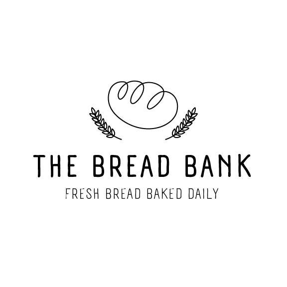
We’ve all heard the saying ’less is more’ and that’s what this trend is all about. Instead of using lots of color and contrast, a minimalist logo design tends to consist of simple fonts, small line strokes, and a limited color palette.

However, that doesn’t mean a logo like that can’t be interesting. Minimalist logos can actually have complex and even 3D elements (we’ll discuss this more below), without being overpowering.

The idea is to create something with less sensory overload for the viewer. A logo with just a few details creates a sense of breathing room for those seeing it, even if they aren’t design experts. Plus, having fewer details to load makes your logo more functional with screens and in other digital formats.

Minimalist logo design for bread shop

Trend #2: 3D Trendy Logo Design

In contrast to the first trend, three-dimensional design elements just started appearing in 2022 and are definitely here to carry into the upcoming years. 3D logos are iconic because they create a sense of realism that seemingly pops off the page, whether they’re online or on paper.

Adding depth or dimension to a logo can create opportunities for unique animation elements or simply to have a static, but eye-catching design. The 3D logo is a creative way to reach your viewer and engage them with your brand.

3d logo for bicycle shop

Trend #3: ’90s and 2000s Nostalgia

We’ve already been through the 80s influence of design and have definitely been moving through the ’90s and early 2000s inspiration. This period is often referred to as the Aughts time period.

If logos become dated so quickly, why reference vintage elements?

Well, truthfully, incorporating elements from the recent past and even what may be, for some of your audience, from the time of their youth, creates a sense of comfort. A vintage flair feels familiar and even may nod towards elements that have been lost in today’s heavily digital age.

Especially if your brand was founded several decades ago, a logo capturing nostalgic elements from that time may go a long way.

Nostalgia logo for beer company

Trend #4: Natural Patterns and Textures

If you want something that feels fresh and modern but can be paired with other trends, consider being inspired by nature! Natural-looking logos incorporate organic shapes that don’t feel so gridded.

And natural doesn’t mean it needs to contain the actual image of a plant. This trend can be accomplished simply by relying on earthy colors and organic-looking elements. As another way to make it pop, consider adding some textures like wood, grain, or stone, that create subtle elements to refresh your logo.

Nature inspired logo

Tips for Achieving a Timeless Logo: Balancing Trends with Needs

Redesigning your logo is a huge undertaking. And while modern logo design trends can influence the direction you go, it’s important to make sure your takeaway logo will last beyond the latest trends.

Logo design trends of 2023 are a great place to start and find inspiration, but you’ll want to make sure to take your actual project beyond them. Approach your project with the mindset of creating a logo that can survive the years to come. (Examples that come to mind include Apple or Levi’s.)

Below we’ll provide some simple tips to remember as you embark on the journey to find a new logo that makes your brand stand out.

1. Have a Long-Term Vision

Talk with your internal stakeholders and get a long-term vision of what you want the brand to look like. Do you want to be known as the funky 3-D nostalgic-looking brand forever? Make sure you all agree on what qualities you want to be known for and create a logo that accentuates that.

2. Base Your Design on Core Values and Products or Services

Who is your target audience and what kind of message are you projecting to them? Aim for a blend of trends and design that will make you look professional and evoke the right emotions in your audience when they see it.

3. Tell Your Story

Because who doesn’t love a story? Remember to avoid stuffing too much imagery or detail into your logo. If there’s too much going on, it can be difficult for viewers to understand what it all means or the story you’re trying to tell.

4. Keep it Simple

What does your new logo look like if it’s scaled up or down 50%? Will it look pixelated or shrunk?

Your logo will be used in a variety of digital and print mediums, so versatility is critical. Subtle elements and text are ideal if you need to use it across multiple platforms. And if your elements are vector, it’s even better for scaling your logo to any size.

5. Watch for Fonts

Fonts will make or break your logo. So make sure to not just pick the first you can find. Fonts also create emotion around your brand. For a more playful approach, try a script. Or for a more serious brand, a serif font may better convey your image.

Additionally, consider the readability. Make sure your font doesn’t just look appealing. It should also be legible.

6. Make it Hard to Imitate

Making sure your logo has a unique factor is about more than distinguishing you from the competition. It’s about making sure it can’t be easily copied. Plus, doing so ensures your new logo isn’t something that’s already been done or accidentally copied based on inspiration from a different company.

Most importantly, you want your logo to not be easily copied. If someone can take your logo and change the name, how will you be recognized? 

Having a one of a kind logo will definitely make you stand out from the rest of the competition and prevent others from taking it. If you make it as unique as your business you may only need slight changes as time goes on.

Ready to find a logo that reflects the message you want to send about your business? Speak with our team to see how our designers can help refine your logo and help it serve you better.

Your website is often a user’s first impression of your brand, so you have to make a statement. But what makes a website stand out? These days, making a website attract attention is more than just ensuring it looks good. It must be easy to use, interactive, and informative. 

If you’re looking at your website analytics and noticing a lot of users are coming to your site and immediately leaving (a high bounce rate) then it might be time to make some UX improvements.

What is UX?

UX stands for the user experience within your digital space and encompasses a lot of disciplines that may be overwhelming to think about. But we are here to simplify and explain what goes into a user’s experience. By definition, UX is how the user thinks, feels, and interacts with your product, or in this case your website.

When a user comes to your site, they may evaluate in 1 of 4 ways, which are defined below. Your website should give the user value, be easy to navigate and be enjoyable to use. To help characterize your UX, ask yourself the following questions: 

Value: Is my site producing value for the user? 

Functionality: Does my site have a lot of page errors? 

Usability: Is my site easy to navigate and interact with? 

Impression: When a user first visits my site, what are they thinking? What immediate actions are they taking?

Difference between UX and UI

The terms “user experience” (UX) and “user interface” (UI) are often used interchangeably, even though they are describing two related but different things. The UI of a website consists of all the elements a user interacts with, buttons, slides, menus, maps, etc., or the relationship between the users and the computer systems and software. 

On the other hand, the user experience, as the name suggests, encompasses the entire experience of the website. UX takes into account how a user interacts with not just UI elements, but every other aspect of the website — load times, color usage, whitespace, mood, and subject matter in imagery, and even down to the amount of scrolling required to view elements on a page. 

When looking to improve your website user experience, think about the big picture. 

Why UX matters for your business

You may think that UX is something that will just help your website look better, but incorporating user-friendly features into your website design will also increase sales, and if applicable, products sold. If you are successful in improving your user experience, your bounce rate should also decrease. 

When a user visits your site, you don’t want them to move on from your site because they are frustrated when they can’t find answers on your site. Your ultimate goal in improving your website user experience is to grab your user’s attention and convert them into customers. 

A website that is aesthetically pleasing is one thing, but you also want a site that is easy to navigate, has limited page errors and motivates users to interact with your company. Creating a site with great UX allows users to trust your brand’s quality and credibility. 

Google Core Web Vitals

There are three Google Core Web Vitals that help determine a website’s user experience. These are the Largest Contentful Paint, First Input Delay, and Cumulative Layout Shifts. These Core Web Vitals will assess all aspects of the user experience and help give you an industry standard. 

We’ve outlined some of our best practices on how to improve user experience on your website that help generate traffic, keep users engaged, and allow users to easily reach their goals on your site. These practices are best paired with a strategic design team that creates content for your user. 

Keeping up with the Best Design Practices

1. Clear Call to Actions

What do you want your users to do while they are on your site? Answering this question will give you call-to-action ideas to incorporate into your site. The RICE marketing strategy will help you determine what types of call-to-action, or CTAs, to include on individual pages.  

If you are looking to interact with users that may not be quite ready to purchase your product or service, try adding soft call-to-actions on your website pages. Soft CTAs are not directing users to perform your main desired actions. Some soft call-to-actions ideas include: 

  • “Join our Mailing List” 
  • “Read Some Customer Testimonials” 
  • “Learn More” 

On some web pages, your goal should be to convert the user to a customer. This stage of the RICE marketing strategy calls for hard CTAs, which motivate a user to perform an end goal, for example, purchasing the product or service. 

2. Internal Linking

When laying out internal linking strategies, be conscious of the path you want the user to take throughout your site. Including internal linking allows website visitors to stay engaged on your site and easily learn more about your product or service.  

3. Take Advantage of White Space

Whitespace web design is crucial for users to be able to digest and understand the content on your website. Having a website that is cluttered with information, graphics, visuals, and other various content will cause users to feel overwhelmed and confused

Whitespace creates a visual break for the user’s eyes. When a user visits your site, you want them to see a clean, polished look that is easy to comprehend. 

Your whitespace web design can include more space between each body of content, margins on either side of the page, and group-related topics with white space. Remember, white space does not mean it needs to be white, the background color of your website can align with your branding colors. 

4. Write to Your Target Personas 

One of the best ways to improve your user experience on your website is to design your website for the user. What needs and pain points will your website solve for the user? Who will be visiting your site? 

Don’t be afraid to ask users questions or have them rate their experience. This feedback will help you shape your website to what works best for your target audience. 

5. Images

Images should enhance the copy and design of your website, not make the site disorganized or overwhelming. When thinking about what visuals to include on your webpage, find ones that explain the copy, evoke emotion, and talk to your audience. Avoid using images to just “fill space.”

6. Metadata 

Metadata may not be the most obvious practice to think about when looking for UX improvements, but having the correct metadata in place will help users find your website. There are a few different types of metadata, including descriptive, administrative, and structural

Your Google snippet will encompass the title tag and meta description, which is the first thing users see if your webpage shows up on their Google search. We recommend a title tag of fewer than 60 characters and a meta description of fewer than 160 characters. 

7. Mobile UX Design 

The UX improvements above are all very important to consider for your next website redesign, but if your site does not perform well through mobile, you’ll lose a lot of your potential audience. 

Key takeaways for mobile UX design are to make everything “thumb-friendly” as users will not have the accuracy of a mouse. Larger UI elements will ease the navigation and interaction points of your mobile website.  

Additionally,  remember that everything will be stacked so the content will appear much longer, requiring additional scrolling on mobile. We recommend keeping paragraphs to a maximum of three lines, so readers are able to digest the content fully without being overwhelmed. 

Mobile UX design is significant because it contributes to your Core Web Vital score. It will assess the accessibility of links, content readability, and other page elements. 

Two people looking at a screen with different mobile designs options

The Role of a UX Designer

The UX Designer will work with user research, front-end design, information architecture, and usability testing to increase your website’s user experience. They’ll help you make your website easier to navigate and interact with, so users are more likely to revisit and engage with your site. 

UX Audits

The UX audit is the first step in identifying any shortcomings on an existing site. The marketing team will comb the entire site, examining not only the UI but the overall user experience. This is to ensure the UX is serving the ultimate goal of the website. During this process, any user pain points or site goal misalignment will be identified and remediation will be suggested to ensure UX improvements across the site.

Ready to boost traffic and engage more users on your site through UX improvements? Work with our experienced web development team to set your site apart!

Times change. Businesses grow. And if your company’s website isn’t keeping pace, it could have serious implications for your success.

Because your website serves as a digital representation of your brand, it’s absolutely critical that you get it right. If not, a website visitor will bounce to your competitor’s site before you can even blink.

Web users are cut-throat. If your website isn’t set up to serve them—and serve them well— they’ll leave you (and any consideration of buying a product or service from you) in the dust.

So, is your website looking a bit dated and dusty? Then it’s likely time for a website redesign. In this blog, we’ll explain what a website redesign is, how it can benefit your business, and help you prepare for a website design in 4 crucial steps.

What is a Website Redesign?

Many people tend to confuse a website refresh with a website redesign. Although similar, these projects serve different purposes and vary significantly in scope. Let’s take a look at the key distinctions between the two.

Website Refresh

A website refresh involves making slight changes to a website while leaving most of the code and structure unaltered. These changes are typically relatively minor, easy to execute, and don’t require extensive time or resources, such as swapping in a new logo or updating old product pages.

Website Redesign

A website redesign is a much more involved process that requires updating the content, structure, format, and navigation of your website to improve its overall performance and convert more website visitors. In other words, it’s going back to the drawing board and rebuilding your website from the ground up.

Depending on your situation, a website refresh may suffice to meet your needs. Or, you might need a complete transformation. Here’s how to know when to go for a full website redesign.

How Do You Know When It’s Time for a Website Redesign?

Before you invest valuable time and resources into a website redesign project, you should make sure that you’re doing it for the right reasons.

“My competitors just redesigned their website, so I want to do something similar” isn’t exactly a good reason if your site is effectively attracting visitors and converting leads. Here are three reasons why you should consider redesigning your website:

1. Your Goals Have Changed

Have your business goals changed drastically since launching your website? If the answer is yes, it likely no longer represents your company accurately. A website redesign can ensure that your site aligns with your current business goals and that they’re conveyed properly to your target audience online.

2. Your Branding Has Changed

If you’ve recently undergone a company rebrand or are planning to update your color scheme, logo, and messaging in the near future, then you should redesign your website to reflect those branding changes and affirm your new visual identity.

3. Your Web Performance has Plummeted

Website performance is a clear indicator of whether or not your site is meeting users’ needs. To determine how your website is performing, ask yourself the following questions:

  • Have leads decreased?
  • Are people staying on the site or bouncing?
  • Is the website converting a reasonable amount of traffic?

If you’ve noticed that your website performance has decreased, that’s a red flag that your website may be outdated or out-of-touch with your target audience. A website redesign can help you identify and resolve issues related to poor performance.

Close up of hands typing on laptop.

How to Prepare for a Website Redesign

The website redesign process involves a lot of time, resources, and decision-making. And, the better prepared you are ahead of time, the easier it will be. Here is how to prepare for a website redesign.

Step 1: Complete A Website Audit

Before you decide what changes to make, take the time to review your current website and determine what’s working well and what isn’t. Be objective and take note of any areas that need improvement so you can address them in the website redesign.

If you need some guidance, here’s a helpful tool that you can use to access how well your site is currently performing.

shutterstock 255995734 jpg How to Prepare For A Website Redesign

Get Your Free Website Check-Up Checklist

While auditing your website, be sure to consider the following:

Content

Evaluate your current content to decide what should be reworked. Look at everything—from blogs to videos to downloads—and ask yourself:

  • Is it audience-focused?
  • Is it easy to understand?
  • Is it helpful or useful?
  • Is it current?
  • Does it match my business goals?

If the answer to any of these questions is no, then that piece of content needs to be updated.

It’s important to note that not everything on your site needs to be changed. Content that’s performing well can likely be left as is. Your website redesign team can help you repurpose strong content, identify gaps, and create a new content strategy to pull it all together.

Search Engine Optimization

In addition to assessing the effectiveness of different types of content on your current site, you should consider if it’s optimized for search.

If you don’t have a search engine optimization (SEO) strategy in place or yours needs to be adjusted, a website redesign could be in your best interest. This is an ideal time to optimize existing content and create new, strategically-worded copy to increase traffic.

If you do have a strong SEO strategy in place, then your current website has likely gained authority and is ranking well for relevant keywords. In that case, it’s critical to have a knowledgeable website redesign team that will properly migrate that content to your new site.

Failure to follow SEO best practices when migrating content can cause crawl errors, search engine red flags, and other penalties that can make your site undiscoverable.

User Experience (UX)

You can have great, optimized content and stunning branding, but if your website provides a poor user experience, it won’t perform well.

Today’s customers don’t just base their loyalty on a product or price, but rather on the experiences that they receive. In fact, 73% of buyers consider customer experience to be the primary factor for their purchasing decisions. This also applies to their experience on a company’s website.

You have about seven seconds to make a good first impression on a website visitor before they flee to another site. So, if your site is hard to navigate, lacks information, and isn’t accessible or mobile-friendly, then your users probably aren’t staying on it.

Thoughtful user experience (UX) design can greatly improve your website performance.

Woman sitting at a desk writing down notes.

Step 2: Determine Your Goals & Budget

We’ve already discussed the importance of having a good reason for overhauling your website. So, what’s the “why” behind your website design? Write out the goals that you have for your new website and tie them to measurable results. For example, some of your goals may include:

  • Increasing traffic to your website
  • Reducing your bounce rate
  • Increasing time on site
  • Generating more leads and form submissions
  • Improving SEO rankings for notable keywords

Communicate these goals with your web redesign team to ensure that everyone is on the same page. This will help them better determine your needs, pricing, and projected timeline.

Before discussing pricing, however, you should determine an amount that you’re willing to spend. Everyone wants a high-quality website that’s built quickly for a low cost. But remember, your website is your greatest sales investment. Cutting corners just to reduce costs can lead to expensive consequences and missed profits in the long run.

Step 3: Define Your Branding

Before you can dive into content and design, you have to decide what look and feel you want your new website to have. Your website serves as a visual representation of your business. So, you want to ensure that your branding matches your company’s mission, values, and overall brand identity.

Being very clear about your desired branding, messaging, and tone will guarantee consistency across your site. During this step, ask yourself what you like about your current branding, what you want to change, and why. Here are two helpful steps you can take to flesh out your intended visual identity.

Create a Style Guide

Once you’ve determined what you’d like to keep and change about your current branding, write it all out in a style guide. Be sure to include your preferences on color palette, logos, fonts, imagery, and icons. Having all of this information recorded will help your team achieve cohesiveness during the website redesign process.

Gather Assets

Now that you’ve defined your branding, you should compile all of the files that your team will need for your website redesign. This includes any vector file logos (.svg, .eps or .ai), photography, and other essential visual assets. While gathering files, carefully consider whether each asset fits into your new style, or if it could use some adjusting.

Two male employees compare color swatches for a project.

Step 4: Choose Your Website Redesign Team

The final step to prepare for your website redesign is choosing who you want to work with.

A website redesign is a big investment, so you need to be able to trust that the people working on your project will get it done right. Since any mishap will cost you time and money, don’t just go with the cheapest option you can find.

Rather, do extensive research before you commit. Look at past projects, reviews, prices, processes, and inclusions for every freelancer or agency you’re considering. Once you narrow down your choices, send out a request for proposal (RFP) for website redesign services. Once you receive the proposals, you can make the best decision for your needs, budget, and preferences.

If you need to make extensive changes, we highly recommend hiring an agency (like Tower) for a website redesign. Agencies typically have streamlined processes in place to make every part of the website redesign process go as smoothly as possible and stay on track. Here are a few other advantages of hiring an agency:

  • Extensive knowledge and services
  • Collaborative group of specialists
  • Access to advanced software and resources
  • High-level professionalism
  • Superior communication

The people you choose to work on your website redesign can quite literally make or break the whole experience. So, be sure to choose wisely!

Looking for the right group of people to bring your vision to life? Check out our website redesign services to see how Team Tower can help!

If there’s anything that’s been learned in the wake of the pandemic, it’s the importance of having an up-to-date online presence that represents your brand just as well as a face-to-face meeting. Your brand is a lot more than just a logo and some copy. It should be an experience.

As a digital marketing agency, we help our clients explore new strategies to elevate their brand via web design, creative, content, and more every day. However, just as we encourage our clients to explore new ideas in their digital marketing, it’s only fair that we take our own advice.

While our brand refresh started in a seemingly “regular”  world, it certainly ended in a changed one. In early 2020, as we dove into redesigning our site, content, and digital assets, our team was suddenly scattered. On top of that, most (if not all) of our regular routines were paused. 

In spite of everything, we successfully elevated and reached our goals. Here’s the “why” and “how” behind our recent brand refresh and some tips you can apply to start your own along the way.

Rebranding vs. a Brand Refresh

Before digging in, it’s important to understand the key difference between a brand refresh and a rebranding project. The idea behind a brand refresh is that you’re reimagining the feeling of your brand using what you already have. It’s primarily a visual process where you adjust your assets to keep your business looking current.

Rebranding your company successfully is a much larger project where you get rid of everything you’ve done previously and start from scratch. This can include creating a completely new brand voice and tone, trying to break into new markets, and completely re-doing your company’s image.

Starting on the Ground Floor

Our previous website was from 2017 and was due for a redesign, knowing it’s optimal to update your site every 3 years. Plus, it was clear it didn’t match the direction our company had evolved into as well. However, the catalyst for updating your digital branding shouldn’t always just be an “older design.”

As soon as your online branding feels out of alignment with your business strategy or vision for the future, it’s an indication that it’s time for a refresh. Sometimes that can just be minor tweaks to what you have, while other times more drastic action is required.

For Tower, we saw a need to elevate our own branding to match the shifts we’d undergone in the past few years. While we didn’t need to do a complete overhaul, we found a lot of opportunities to push ourselves beyond what we had done in the past.

Why a Brand Refresh Matters for Your Business

Your business is making progress every day. As you move forward and scale your company, it’s important to also continue refining and evaluating your brand to keep it sharp. This doesn’t always require designing a completely new logo or color palette. Refreshing your brand can include updating content on your service pages or replacing old, outdated images.

There’s no set time frame for how often you should be doing a brand refresh. However, the industry you’re in can have a hand in how often you make these types of changes.

If you’re a brand rooted in history, stability, or security (like a financial institution or college) you shouldn’t have to refresh that frequently. However, if you’re in a fast-growth industry like tech, your business will likely need a brand refresh more often to compete in the digital landscape.

The Key to Re-Doing Online Branding in Digital Marketing

When it came time to approach this project, our team found it extremely helpful to establish some simple ground rules and then outline a process before digging in. Our ground rules throughout the whole process were to:

  1. Keep our signature green color
  2. Keep our current logo
  3. Keep Cabrito (our main typeface we created internally)

From there, we then completed a visual audit of all our materials including our website, business cards, previous campaigns, social media posts, and much more. Our team sorted various assets into two categories — one for assets that “work” and one for those that “don’t work.”

While this part of the process required a lot of back and forth between our broader team, it spurred useful conversation. This audit allowed us to pair down the elements we liked and the ideas behind them, as well as see what areas needed the most attention. From there our team got to work redesigning creative, strategizing SEO, experimenting with dev, and drafting new content to match our updated brand voice and tone.

BUSINESS CARD compressed Tower's Brand Refresh: Elevating to Meet What's Next

Think Outside the Logo

For any business diving into these types of changes, the biggest pitfall is thinking your brand is just a logo. At Tower, we encourage you to take a holistic marketing approach. Ultimately, your business is conveyed through everything — fonts, type treatments, colors, patterns, layout compositions, photography, written content, and much more.

The goal is to make sure all these elements are cohesive to the point that even when viewed separately, they still clearly portray your brand in the same light. When you take the time to do this, the benefit is that your brand becomes recognizable for consumers. It sticks.

For Tower, we started by pinpointing the areas we wanted to change and then got to work fine-tuning every single element. In the end, our goal was to make sure everything fit that holistic approach.        

Finding Your Inspiration

Our office has a saying that first came to light when our team brainstormed for a campaign a few years ago — “elevate.” Over time, it became a crucial part of how we approach marketing for clients and, ultimately, ourselves. We took that concept and we ran further in terms of this brand refresh.

“Elevate” was behind every decision we made in the process. We went as far as taking pieces we thought were good and working to make them even better.

Anything that wasn’t working and had even become dated or cliche was scrapped altogether. The idea of “elevating” became our litmus test for all design, content, and development choices. 

Staying Inspired in the Unexpected 

While the state of our clients and our business had to rapidly evolve to respond to the pandemic, our team still continued pressing forward with our brand redesign. If anything, the pandemic opened up interesting opportunities to look at the idea of collaboration differently.

Collaboration is certainly the key to creating, however, there is also great value in having a chance to actually retreat from distraction and do the work itself. Being remote gave us a chance to become fully immersed in the project and our ideas without any interruption. Working in this hyper-focused manner was actually a huge benefit to developing the more difficult and complex elements.

However, our team also balanced working remotely by supplementing our progress with check-in meetings and plenty of video calls. Doing this allowed us to clearly communicate and stay on the same page. 

Ultimately, here’s the biggest takeaway — it’s important to build in pockets of time to collaborate on refreshing your brand with others, while also balancing it with uninterrupted time to work individually on it.

REMOTE WORK compressed scaled Tower's Brand Refresh: Elevating to Meet What's Next

Staying One Step Ahead of Your Competition

With any brand refresh, it’s crucial that you’re aware of the competitor landscape. You want to make sure that, in the end, your outcome goes far beyond what they’ve done so you can carve your own unique spot in the industry.

Make sure that a part of your project includes investigating your competition. Ask yourself the following:

  • What are they doing?
  • What are they saying?
  • What is their user experience like?
  • What can you do better?

You want to avoid doing or saying the same message. Otherwise, you won’t stand out. You need to be refreshing your brand not not just to “look good” today, but to ensure you stay relevant in the months ahead.

Develop Your Unique Value Proposition

As you’re working, make sure you take time as a team to be introspective of your company. Clearly define what makes you different. In our case, it was the idea of “elevating.” However, that won’t be the differentiator for every company, and you’ll need to decide what makes yours unique.

It’s worth devoting the time to sort this part out during your brand refresh process. Knowing your unique value proposition as a business will keep your strategy clear and brand refresh work cohesive. Plus, that differentiator can even become the very hook that draws in your target audience to choose you over your competitors.

Know it’s time for a brand refresh, but need help executing it? Contact our team to learn how we can help you reach your next goals with our creative services.

If you’re familiar with the phrase UX (user experience), you probably relate it to the design elements of a website.  More specifically, you may associate UX with how users navigate a site and how easily they can find the information they want. UX is such an important element to website design that it has spawned new a new career field :: UX Designer.  Through user research, testing, and analysis, UX Designers create user-friendly websites that meet and exceed user expectations.

Good UX, however, goes beyond the design elements of a website and extends to the content you include on your site. The content you provide and how you serve it up to users is incredibly important to the success of your website.

What is UX Writing?

UX writing, or UX copywriting, ensures that your website includes the content that users are looking for and that it’s formatted and presented in a way that drives action. Many people believe that UX writing is solely focused on the bits of micro-copy that are often overlooked on a website, CTA copy on a button, the “no thank you” copy on a pop-up, or error messages on a log-in or contact form. These are all examples of the concise, to-the-point copy that spurs users to make one decision or another.

The principles of UX writing should also encompass other areas of web content. Even on pages that include more in-depth copy, you can still incorporate the same UX writing techniques that you would on small snippets of content. This includes writing content that users can quickly absorb (through the use of subheads and bulleted lists) and providing content that funnels users through the buying journey.

Why Is UX Writing Important?

wireframe of website homepage with no ux copy

This wireframe graphic that we use on our homepage is a great visual representation of how hard it can be for a user to navigate your site when UX copy is absent. While this is a bit of an extreme example, it shows why UX writing is such an important part of the overall user experience.

As we mentioned above, strong UX writing, when paired with good UX design, creates an optimal online experience for your web users. It encourages them to make decisions that funnel them through your site and take the desired action – whether that’s to purchase something, download material, or signup to receive more information.

Smart UX writing is essential in capturing and keeping users’ attention.  If your website copy isn’t engaging, doesn’t immediately show the user how they benefit, or is too long and cumbersome, they will bounce from your site (and may never return).

Finally, powerful UX writing makes the user feel that you understand their problem or need and demonstrates how your brand can help them find a solution. When a person feels understood or if they know others have had success solving the same problem, they are more likely to trust your brand.

UX Writing Best Practices

As you begin evaluating the UX writing on your website, take a look at these copywriting tips and see how many are implemented on your site. If the answer is “not many,” don’t feel discouraged. You don’t have to go back to square one. I think you’ll find that with a few small changes, you’ll see a big improvement.

Content First

This is a “chicken vs. egg” debate that we often have internally. Should content be written first, or should design be completed first? In most cases, it’s beneficial to have content first so you can ensure that the design allows enough space for your key messages. Even when you’re working with small segments of microcopy, make sure to create your message first and build the design around it.

Humanize Your Brand

UX writing is an excellent opportunity for your brand to show its human-side. Use these points of engagement to create a conversational tone, or even incorporate humor. UX copywriting often involves bite-sized amounts of copy, but they are often memorable. This example from our Contact page shows how we incorporated Tower’s personality into our page headers:

example of UX copy on a Contact Us page header

Be Concise

The goal of UX writing is to drive action, so you don’t want your users to get lost in blocks of text. Of course, there will be areas of your website where long-form content is necessary for informing and educating users, but when it comes to the final call-to-action, you need to keep it simple. “Check Your Score,” “Watch Our Video,” or “Let’s Get Started” are short, to-the-point, and let users know what to expect.

Show That You Understand

Users on your website have a problem, and they are looking to you for a solution. So it’s important to show empathy and let them know that you understand their struggle. As we wrote the content for our internet marketing service pages, we thought about the questions and concerns that we hear most often from our clients and addressed them right from the start. It showed that we understood the challenges they were facing.

example of UX writing on a services pages

Create Hierarchy

We mentioned that UX writing is meant to drive website users through the customer journey, and to be successful, you need to organize your content using the AIDA funnel (attention, interest, desire, and action). Start with a headline that draws attention, lead into informational content that builds interest, provide an offer that sparks desire, and finish with a call-out that initiates action. It might seem like a lot to fit into a small amount of copy, but this example from Moz Pro shows that it can be done.

example UX copy following AIDA funnel

Focus on Positive Language

Have you ever encountered a sign-up form for a health-related product (whether it’s a meal planning guide or an online exercise program) that offers two options :: “I’d Like More Info!” or “No Thanks, I Want to Stay Unhealthy!”? It’s the worst, and it’s not a motivator. Don’t insult people who aren’t interested in your offering at this exact moment, as you may lose them as a customer for life.

Avoid Technical Jargon

Your website users will have varying degrees of knowledge about your products, services, or industry as a whole, so you need to be careful with the terminology you use in your UX copy. Avoid unfamiliar acronyms, technical phrases, or industry buzz words. If they cannot be avoided, take the extra step and provide information that your users can read, watch, or listen to learn more. Here’s an example of how we accomplished this:

example of UX writing

While domain authority isn’t exactly industry jargon, for someone who is not familiar with the term, we included a link where they could read more about it.

Do A/B Tests

As with all elements of your website, UX copy should not be static. If you’ve identified a button, sign-up form, headline, or other content areas that users aren’t responding to, switch it up. Use different calls-to-action or headlines over the course of several months, and then review your site’s Google Analytics data to determine which copy options drove the most user engagement.

UX Writing Tools

As you get started in your UX writing process, these tools can help you implement several of the best practices outlined above.

Crazy Egg This is just one example of a heat map tool that can zero in on the areas of your webpage that users’ eyes are lingering on. You’ll quickly see reading patterns emerge that show how users are skimming your page content.  The red/orange “hot” areas are prime real estate where you should be sharing your most important content.

Headline Analyzer This simple tool offers so much useful feedback on the headlines or email subject lines you write. It identifies uncommon, powerful, and emotional words that will resonate with users.  It also rates whether your headline or subject lines give off a positive, neutral, or negative sentiment.

Hemingway This UX writing tool will determine how complicated your content is for your user to comprehend. It identifies lengthy sections of text that can be broken down or text that’s too dense and complicated for your average reader.  It also rates your content with a grade level readability score.

If a brand new website isn’t on the horizon, implement a UX upgrade instead.

This post was originally published in October 2016. It was updated in November 2019.

Eight seconds. A website user’s attention span lies somewhere around eight seconds. In the time it’s taken you to read these opening lines, you’ve probably picked up your phone at least twice, were distracted by something in your peripheral vision, or started mentally making a to-do list.

There’s a lot of competition for users’ attention online (and offline), so here are a few ways you can fight against short attention spans and entice users to stay on your website for longer than a goldfish can concentrate on something (which, for the record, is nine seconds).

Shorter Attention Leads to Higher Bounce Rates

Bounce rates reflect whether your website visitors click through to the second page of your site, or if they leave after viewing just a single page. These are called single interaction visits. They can often be a sign that your website is too difficult to use, information is not easily found, or the information within is uninteresting/unappealing to your users.

Average bounce rates can vary between 20 – 90% depending on the type of website you operate or even the type of page users are viewing. The chart below, created by Conversion XL, shows that eCommerce websites average a 20 – 45% bounce rate, while blogs and special landing pages average a bounce rate of 60 – 90%.

bar graph showing bounce rate of different types of websites

Online shoppers typically spend a longer average time on a website as they browse multiple products.  However, blog posts or landing pages can have a considerably higher bounce rate, especially if they are not designed, written, or formatted to grab visitors’ attention.

But, also consider that a high bounce rate doesn’t always mean your website is in trouble. A visitor looking for your address or telephone number can quickly visit a locations page, contact page, or even the homepage and find the information they need very quickly. While it may result in an average bounce rate of 70-90%, it also results in satisfied users.

How to Keep Visitors on Your Site Longer

The Faster the Better

The very first way you can lose a website user’s attention is by keeping him or her waiting.  The speed at which your site loads can make or break you in terms of keeping a user on your site. And users have the need for speed.

You can test a page’s load speed by using Google PageSpeed Insights or Varvy. If your results come in higher than user expectations, you may want to pay attention to the following elements of your site:

  • Reduce server response times
  • Condense images and media
  • Prioritize visible content
  • Enable browser caching
  • Optimize CSS, HTML, and JavaScript
  • Minimize redirects

Know Their Habits

One of the best ways to keep web users’ attention is to build your site and present your content to mirror the way they read (or, more than likely, skim) through your site. There’s no shortage of research on how people interact with websites, but here are some of the highlights we pulled to help you harness your readers’ attention.

Readers Follow An F-Pattern

When researchers conducted an eye-tracking study, looking at how users viewed thousands of web pages, a dominant reading pattern emerged. The F-shaped pattern showed that readers typically scan three main areas of a web page.

  • A horizontal movement along the top of your content area.
  • A second, but shorter, horizontal movement further down the page.
  • A vertical movement, which researchers called a “slow and systematic scan” down the left side of the content.
example of f-pattern website tracking

They Go Beyond the “Digital Fold”

Because of a website user’s short attention span, marketers often feel they need to cram as much information as possible into the top part of their website, which is often referred to as “above the fold.”  And yes, it is important to provide key information to your readers as quickly as you can, but the main point here is “key,” not “all.” Smart web users know they need to scroll down a web page, and they will happily do it. In fact, analysis from over a billion web visits shows that 66% of attention on a normal media page is spent “below the fold.”

website users read below the fold

Users also know that the call-to-action and suggested next steps are found at the bottom of the page, which is why the bottom is the second most-viewed section of a web page. Give them what they’re looking for with a strong call-to-action to round out each web page.

Engage With Video Content

There are many good reasons to incorporate video into your website. Video allows you to tell the stories that help users learn about and trust your brand. Video also provides users with short attention spans with an option beyond reading through pages of long-form content. Videos are quick and colorful and keep users engaged longer.

Don’t be intimidated by video. Not everything you create needs to be splashy, high-production content.  Here are a few ideas for video content to include on your website:

  • Homepage video
  • Product demonstrations
  • How-to videos
  • Brand story/history video
  • Client testimonials
  • User-generated video

Grab Visitors’ Attention with a Friendly Reminder

How many browser tabs do you have open right now? Is the article you started reading with your morning coffee still there? You may have already forgotten why you went to those sites in the first place. A multi-tasking audience with a short attention span can be hard to overcome, but we discovered a fun way to make your site’s browser tab stand out from the rest and encourage visitors to return to their session.  Just take a look at these two browser screen grabs…

Snip20161018 6 Winning the Fight Against a Website User's Attention Span
Snip20161018 9 Winning the Fight Against a Website User's Attention Span

Did you catch the difference?  The “Thoughts on Users” tab changed to “Don’t Forget to Read This…” when I clicked over to another tab.  A small touch, sure, but in that eight-second span, it may be just enough to bring back an attention-challenged user.

P.S.

I’ve hidden eighteen typos in this post to ensure that you were paying attention. Just kidding, I didn’t.

If you need help creating the written, visual, or video content that grabs visitors’ attention, contact our digital marketing specialists!

In 2016, online sales of physical goods amounted to $360.3 billion and are projected to surpass $603.4 billion in 2021. Maybe you’ve used a brick and mortar retail strategy for years and are now ready to jump into online sales. Or maybe you’re a new business that will be selling online from day one. Either way, you’ll need to build an eCommerce website.

This can be accomplished in many ways — from adding a simple PayPal plugin on an existing site to creating a brand new, custom site. No matter how you get it done, here is a rundown of what successful eCommerce websites all have in common.

eCommerce Website Design

A More Complex Sitemap

When a client comes to our team seeking an eCommerce website design, we know up front it’s going to require additional or different components than those found on a standard website design. This results in more time spent early on in the design process as we finalize the sitemap, categorizing individual products and determining how each category page, sub-category page, and product page connects to other pages.

Additional Page Templates

For a traditional website design project, there may be a handful of unique page templates created —  homepage, contact page, careers page, service page, etc. As the website is built, all pages can be created from these approved page templates.

When completing an eCommerce website design, additional template designs will be needed, such as templates for a category page, subcategory page, product page, cart page, and check out page.

Other design features that may be incorporated into your eCommerce web design include:

  • product “quick view” pop-ups
  • online catalogs
  • product reviews
  • recommended products areas

The Power of Product Photography

Strong product photography can make or break eCommerce sales. Customers don’t always feel comfortable making a purchase if they don’t know what they’re getting. Product pages should include multiple photos whenever possible, including:

  • products on a white background
  • product views from all sides
  • close-ups of unique details
  • photos of all colors, prints, or other variations
  • products in and out of the packaging
  • products in use

Building Your eCommerce Website

Choosing a Content Management System

Building an eCommerce website starts with choosing a content management system (CMS). It is important to understand the limitations and designs of certain content management systems.

WordPress is a widely-popular CMS that was developed initially as a blog management system but quickly grew to incorporate full, custom sites and eCommerce sites through its WooCommerce platform. Other platforms, such as Magento, were strictly made to handle eCommerce, while a third platform category, that includes ExpressionEngine and the Expresso Store, was built to incorporate both website development and eCommerce.

Each has its own pros and cons:

  • While WordPress is generally easy to code on and has a large number of documentation and plugins to fit almost every need of an eCommerce store, its search functionality is sometimes lacking when it comes to larger stores. WordPress is also frequently targeted by malware, just based on the popularity of the CMS.
  • Magento is built to handle larger sites with many variables, but their limitations aren’t as easily fixed as WordPress which has the history, developers, and documentation to back it up. Furthermore, Magento’s search engine optimization may require additional installations which could cost more money.
  • ExpressionEngine is a completely custom CMS, so you can build based on your needs. However, this means that support issues could take longer to complete based on complexity.

Off-site Payment Processing vs. On-site Payment Processing

Off-site payment processing involves the user leaving your site to complete the sale. This is easier to manage from a business standpoint and many users feel more comfortable paying through trusted names like PayPal or Authorize.net. However, you are driving users away from your site. You will also be limited to the check-out process of the authorizer, as opposed to setting up any custom fields you’d be interested in adding.

On-site payment processing is more expensive but it keeps the users on your site and provides the ability to add new fields to capture user information in the future. Many on-site payment processors come with a monthly fee.

SSL Certification

For every eCommerce website we build, we acquire an SSL certificate.  An SSL (Secure Sockets Layer) is an extra layer of security that encrypts a customer’s personal and credit card information as it travels from the web server to a browser. The only difference you’ll see in your final site is that your website’s URL will begin with HTTPS instead of HTTP.

SEO and Content Support for eCommerce Websites

Optimize Category Pages

Category pages are very useful, especially for shoppers who don’t know the exact product they are looking for. Optimize your eCommerce catgory pages by:

  • Focusing on your product categories. If you have thousands of products, trying to produce unique content may be overwhelming. Center your SEO efforts on amplifying the product categories by optimizing internal links and adding relevant products to each category.
  • Adding specific and relevant content to each of your category pages.
  • Building deep-links to product categories. Use social media and other forms of content marketing, such as blog posts, to build internal links that help drive relevancy.

Avoid Duplicate Content

Unique content on product pages can be an issue when building an eCommerce website. In many cases, product information is gathered from a database, leading to duplicate content. How many times have you seen a product page where there is only a photo, SKU number, and few generic bullet points? How are users, never mind a search engine, going to understand what the page is about and what your products relate to when there is a lack of information? This is how you can avoid duplicate content on your eCommerce site:

  • Manually add content to your most popular product pages. Use Google Analytics to identify the best-selling product pages and make sure they have unique, relevant content that is easy to understand.
  • Add user generated content. When users add content, it will distinguish your products from one another. Use reviews, user photos, and endorsements to help incorporate unique content.

Product Copy In Great Detail

In terms of optimization, search engines love long-form copy. The more content on a page, the more opportunity to incorporate vital keywords throughout the text. Lengthy copy also provides more opportunity for creativity and intrigue, keeping customers on the page longer and building interest as they read.

However, writing just for the sake of writing won’t cut it. Once you’ve given the basics (size, color, materials, best uses, etc.) and what makes the product unique, explain how customers will benefit from the purchase. Be sure to include a call to action, providing the customer with further steps to take like add to cart, save to favorites, or view similar products.

And remember, a picture is worth a thousand words so your product pages need to include high-quality photography. Product videos will also take product pages to the next level. This can include sales videos, instructional videos, or 360 product videos. Encourage your customers to submit images of them using your products so other shoppers can share in their user experience first-hand.

Don’t Forget Schema

We have spoken about the importance of structured data, specifically schema.org. eCommerce sites have content that is optimized for humans but not necessarily for search engines. Adding markup code to product pages using schema.org will provide search engines with access to your data and an understanding of your products. These protocols developed by schema.org will assist Google in returning properly-organized results for users’ search queries.

How to Reduce Shopping Cart Abandonment

When customers shop online, they generally don’t feel as rushed to make a decision as they would shopping in-store. Rather, an online shopping experience leaves plenty of time and opportunity to really think the purchase through before making a final decision to buy. This can often result in an abandoned shopping cart.

Price discrepancies and an unfriendly check-out process are two of the main reasons that online shoppers may abandon their purchase and are red flags you want to avoid when building an eCommerce website.

Eliminate Cost Confusion

Shoppers often abandon their carts when they get to the checkout and realize that the cost is higher than expected or that there are unexpected costs associated with the purchase. A good way to settle this confusion is to have an area at the side or top of the screen that provides a snapshot of their cart along with their total so far. This way, the customer knows the whole time what their running total is, eliminating surprises at the end.

Help Shoppers Save on Shipping

Another reason shoppers abandon their shopping carts is that they don’t want to pay shipping fees. In fact, 58% of shoppers will leave their order if shipping costs were more than expected. Free shipping is a wonderful incentive to encourage shoppers to buy. But if you can’t swing this deal all the time, consider one of the following options:

  • offer free shipping as a promotion only during peak selling seasons
  • offer a  low, flat-rate shipping fee
  • add an option to pick up in-store, if you have physical retail stores
  • create product discounts that compensate for shipping costs

Be sure to promote your shipping deals as soon as a customer lands on your site, on home page banners and page headers. Even better, provide the option: “no promo code needed,” and automatically add free shipping or flat-rate shipping to their cart.

Effortless Shopping and Checkout

Shopping is meant to be fun and easy. Customers hate complicated navigation when shopping and will leave the site if too much effort is involved. Make their shopping experience easy and enjoyable by simplifying every step of the way.

  • Sometimes shoppers abandon their cart is because they were just browsing. Offer the option to create a “save for later” list so they so they can keep track of the items they are interested in.
  • Another way to reduce frustration for your customer is to provide images of their items in the shopping cart instead of a description. This allows them to glance quickly at what they have and continue with their purchase.
  • Don’t make it impossible to navigate away from the checkout page. Oftentimes, shoppers want to continue shopping (which is a good thing!) and should be able to return to a category or product page without hassle.
  • Make the actual checkout process a breeze! Provide a bar that shows their position in the checkout process so they know how close they are to completion.

Enhanced eCommerce Tracking

What is Enhanced eCommerce?

After building an eCommerce website, you’ll want to track its successes and find opportunities for improvement. Enhanced eCommerce enables you to measure user interactions with products on your site. These interactions could be product impressions, clicks, product detail views, add to cart, check out, completed transactions, and even refunds. Analyzing this data is easy and completely free with Google’s Enhanced eCommerce plugin.

Step 1 – Setup

In order to get started with Enhanced eCommerce, your web developer will need to remove the general Google Analytics code from your site and replace it with the Enhanced eCommerce code that’s generated through your Google Analytics account.

Once the code is verified, you’ll need to enable eCommerce and set up the funnel of your website’s check out process. This will help you understand the drop-off points, which can be extremely helpful during your busy seasons.

Enhanced E-commerce Analytics Set-Up

Step 2 – Measure Customer Activity

The hardest part of this step is waiting for the data to compile. We recommend giving yourself at least three to six months of data before truly analyzing customer shopping and checkout behavior through Enhance eCommerce tracking.

In this example of eCommerce tracking, our client was able to analyze the drop-off rates of their checkout process. With Enhanced eCommerce they could also:

  • track coupon codes and other marketing campaigns
  • report on product performance, sales performance, and product list categories
Enhanced Ecommerce analytics screenshot

Step 3 – Analyze, Compare, Repeat

Now you have a starting point. Going forward, you should complete comparative checks every quarter. Compare downtimes to peak traffic times, year-over-year sales, and similarities and differences between shopping behaviors and general website use.

Stuck on how to optimize your eCommerce site? Need a hand building an eCommerce site for your brick-and-mortar store? Let us do the work for you.

When you hear the phrase parallax scrolling, what do you think of? The title of the next Star Trek movie? That’s exactly what I thought it was. When I was told that I was wrong, the next thing I said was, “Well then, what is it?”

Turns out, parallax scrolling is the next big thing in web design. Many companies have seen the benefit and the fun in these types of websites, including Tower Marketing. This trend began back in 2011 when Nike launched its website, “Nike Better World,” and it hasn’t stopped since. Basically, it is a scrolling technique in which background images move at different speeds than images in the foreground. This creates a 3D effect or an illusion of depth on your website.

Why Use Parallax Scrolling? – An Outsider’s Viewpoint

I say an “outsider’s viewpoint,” because I am in no way a designer or web developer. When I look at a website utilizing parallax scrolling, I am looking at it from the viewpoint of an end user. If I like the way a website uses parallax scrolling, it is because I thoroughly enjoyed the user experience. Parallax scrolling completely changes the way users interact with a website. Instead of simply scrolling from the top to the bottom of a flat, stagnant page, the user is taken on an eye-catching journey where shapes, pictures, and other animations morph on the screen and reveal new portions of the site.

This is all well and good, but let me reiterate the importance of user experience. Having a visually appealing site always puts points on the board, but if I’m scrolling through a beautiful website and it stutters, or I can’t locate a button to take me to the section of the site I’m looking for, then you have scored negative points.

Examples of Parallax Scrolling

Now that we have gone over what an outsider thinks about parallax scrolling, let’s look at a few examples of this trendy scrolling effect. I came across a list of 50 great parallax scrolling websites from 2014, and I have to say, some did not work well in my opinion. A few examples looked interesting, but they tended to lag on occasion. Their overall user experience was poor.

However, I did come across a few great examples of parallax scrolling (once again, this is my opinion as the end user):

1. Highway One

Screen Shot of Highway One Parallax Scrolling Website

This website takes you on an animated car ride down the coast of California on Highway One. As you scroll, your vehicle passes through the many landscapes of California, all while providing instructions on what to do if you get lost. The tour includes radio stations in the area, facts, and cameos from the likes of Sean Connery as his character from the Alcatraz movie, The Rock, and Will Farrell as Ron Burgundy.

2. Sony – Be Moved

screen shot of Sony's Parallax Scrolling Website

Sony’s site for their “Be Moved” campaign goes through many of its new products as they assemble themselves on your screen while you scroll. The animation can be a little bit choppy, but overall it provides a great experience. I played with this site for a while, as I watched how each small piece of technology came together to make their smartphones, cameras, and TVs.

3. Make Your Money Matter

Screen Shot of Public Service Credit Union's Parallax Scrolling Website

This website, done for Public Service Credit Union, also takes the user on a visual journey that flows well without any hiccups. It also does a great job of showing and telling the message, which is the importance of credit unions and how they can benefit someone. It finishes with a simple screen that tells you how to join a credit union in your area.

Do you have a website that utilizes parallax scrolling? Has it benefited your company? Tell us about your experience!

Do you have a website that utilizes parallax scrolling? Has it benefited your company? Let us know in the comments!