 By Kimmick
 Simple Stylish Accessible Color Palettes: 5 Easy Steps for Web Designers
- Branding
- Content Marketing
- UX
- Web Design
Join Our Newsletter List

As a web designer, you have a keen eye for detail. Creating color palettes and arranging elements in a visually pleasing way is your job after all!
But when you’re gifted with these abilities, it can be easy to forget that some people struggle to see what we’re able to perceive with ease.
Over 2 billion people worldwide (more than a quarter of the world’s population!) have some form of visual impairment.
Glaucoma, cataracts, and color blindness are just a handful of the challenges they face—the same challenges you should also be taking into account when creating an accessible color palette.
If you’ve been tasked with creating an ADA-compliant website, these five easy steps will help you create a user-centric experience for everyone.
1. Understand Compliance
Understanding ADA compliance can be tricky. Unfortunately, it’s not as simple as a checklist you can reference when building your site. The law only states that you must provide “reasonable accessibility” to people with disabilities, like the ability to use a screen reader and fill out forms.
Although it isn’t a legal standard, most developers and designers follow the Web Content Accessibility Guidelines (WCAG 2.0), which include three levels of compliance: AAA, AA, and A.
Accessibility consists of so much more than color, but for the purposes of this blog, we’re going to focus on which level your site would fall into based solely on your use of color.
WCAG Levels of Accessibility
- Level AAA
This is the strictest level of compliance. Level AAA is often used by government agencies, medical providers, and organizations that receive taxpayer funding. - Level AA
This is the median level of compliance. For the majority of companies, level AA provides a balance between meeting legal requirements for usability and having design flexibility. - Level A
This is the lowest level of compliance and is not recommended in terms of color. Color combinations that fall below levels AA or AAA will be considered a “fail” by color-checking tools.
How Compliance is Determined
Your design’s level of color compliance depends on two factors: the contrast ratio between the foreground (text) and the background, as well as the point size of your text.
A contrast ratio of 7 or higher is considered AAA compliant, while 4.5 through 7 will meet AA standards.
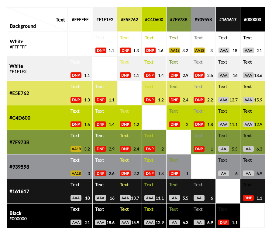
An example of a color contrast checker using Tower’s brand colors.
Some color combinations will be AA18 compliant, meaning they are readable at 18px (or 14px bolded) and above. If you do choose to use “borderline” complaint colors like these, however, you should take into account that text may scale down for mobile and no longer meet this size threshold.
Of course, there are exceptions to every rule. If your client is using a font that’s unusually tall or narrow, you may need to find a contrast ratio even higher than the AA minimum.
2. Evaluate Your Accessible Color Palette Needs
Are you confined by your client’s strict brand standards, or do you have the freedom of a blank slate? We have tips for navigating both scenarios.
Working With an Existing Color Palette
With all the attention that goes into carefully crafting a brand, the idea of having to rethink a set of carefully-chosen Pantone colors can cause brands to balk at making updates for accessibility.
Luckily, there are minor tweaks (that no one except a designer would notice!) that can make a website fully accessible. Even slight alterations to a color palette can give you more viable background and text color combinations, making for a more dynamic and engaging site.
For this Tower client, minor adjustments to their existing red and black tones gave us twice the AA and AAA-compliant background and text color combinations.
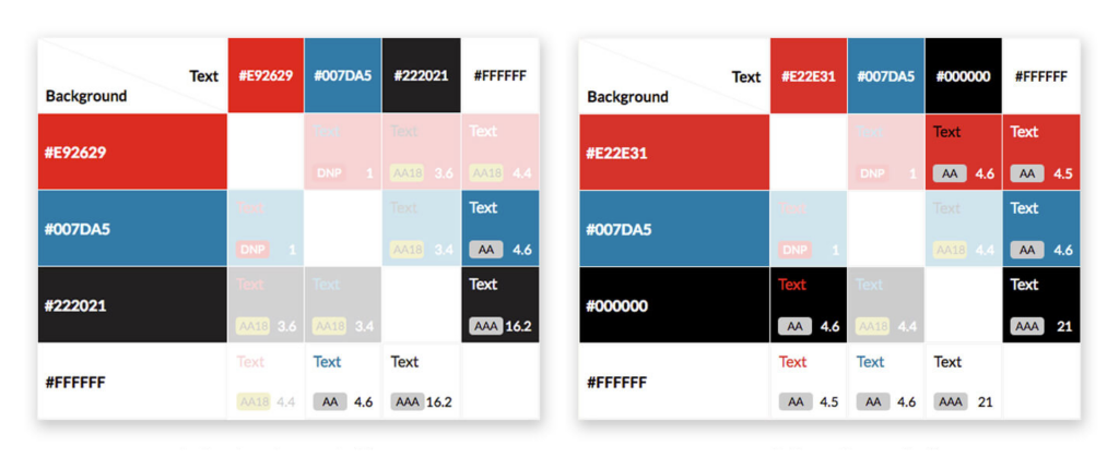
The client’s original color palette (left) vs. the updated version (right).
If you’re unable to modify a brand’s existing colors, you’ll have to get creative. Find a few key color combinations that pass as accessible color palettes, and then use photography, iconography, and infographics to add more color throughout the site.
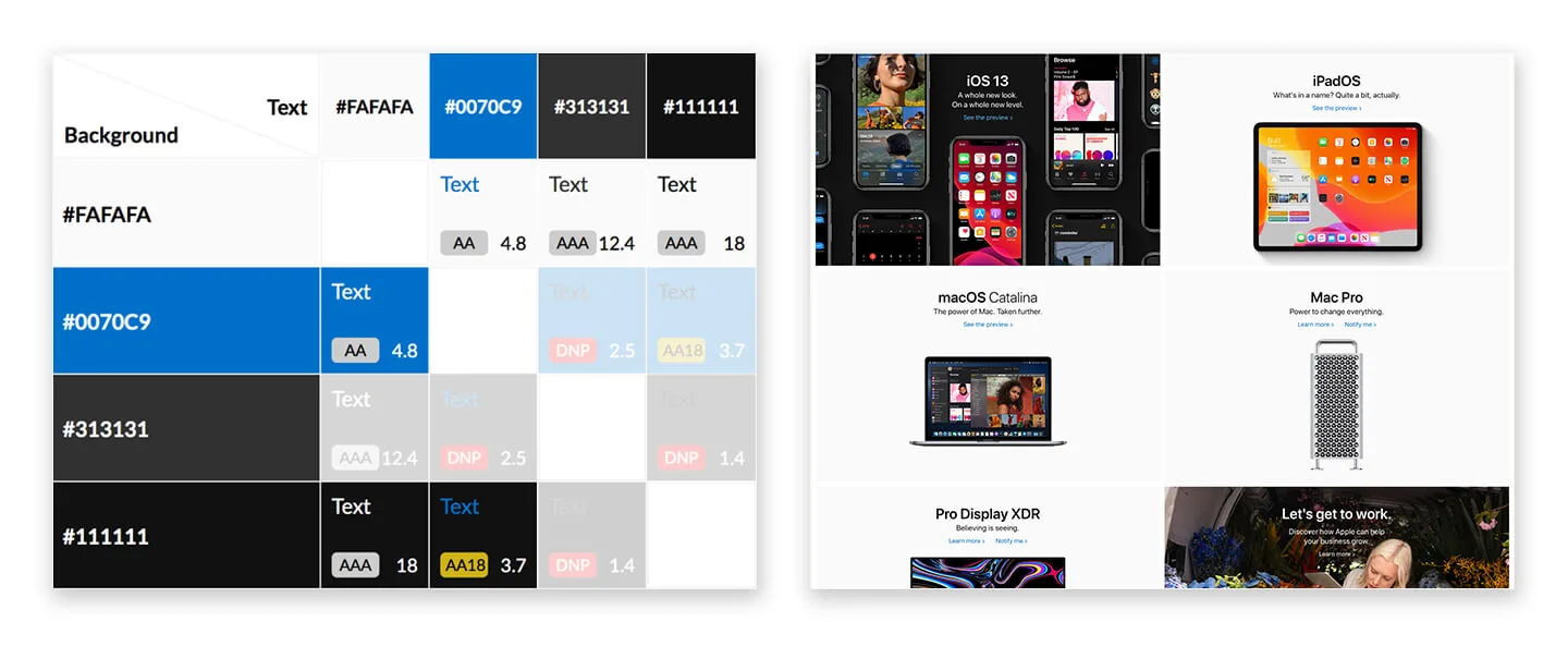
Take Apple for example. Their fully-accessible homepage is bright, dynamic, and beautiful, and it utilizes only four colors in six combinations—proving that accessibility is only a restriction if you make it one.
Building a New Accessible Color Palette
Being able to design from day one with accessibility in mind is a huge advantage—and it’s really no different from designing any other good color scheme. In fact, to make strong and accessible color palettes, you only need:
- One or two base colors
- A strong call-to-action color
- A handful of neutral colors
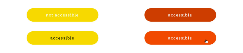
Call-to-action colors are typically where designers struggle to remain compliant. If your CTA button is lighter (like yellow or light orange), try dark text instead of the more traditional white. You can also save fun, bright colors for hover states and opt for a slightly darker default tone. This can help buttons draw visual interest while still keeping them compliant.
3. Find a Color Contrast Tool That You Love
If you’re working on a new website or a website redesign, you’re going to spend a lot of time with your color contrast tool. So, take a moment and find the one that works for you. Here are a few recommendations!
- Contrast Grid from EightShapes — This is our all-time favorite at Tower. It allows you to investigate not just one color, but all of your colors in context with one another. It also generates a unique link for every color palette, making it easy to share with clients, other designers, and developers.
- Toolness — This is a similar tool that grays out non-accessible background and text color combinations. It can be especially helpful in visualizing and explaining compliance to those who are new to the guidelines. Since there are no non-compliant combinations shown, they won’t distract from the fully-accessible options.
- Colors — We love this tool for its sheer inspiration and dozens of bright, exciting accessible color palettes. This can be a great place to start if you’re feeling overwhelmed.
- Color Safe — This is another great option for creating an accessible color palette, as it also takes into consideration the specific typeface and font weight you’re using.
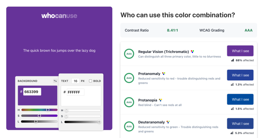
- WhoCanUse — Finally, we recommend that you test your accessible color palettes with this tool that shows how people with color blindness, glaucoma, cataracts, and more will perceive the tones you chose (as well as what percentage of the population has these visual impairments).
4. Adjust and Iterate
Chances are, the first accessible color palette you try won’t be quite right. There may not be enough accessible options, and even if there are, the combinations available may not be a good fit for your client.
Context is Key
Play with your colors in the context of your design program. If you’re making minor alterations to an existing palette, check your new colors alongside old collateral. Is the difference noticeable? Is that a problem?
Consider print applications as well. Colors may look great online but horrible on paper, and vice versa.
Utilize the Right Design Tools
Having a powerful tool at your disposal is the key to working accessibility into your existing design process. At Tower, we use Sketch, a design program with a nearly endless library of plugins.
Stark is a color contrast analyzer that operates right inside your design file. It also has the unique ability to mimic different types of color blindness, from the most common to the very rare.
This is especially important when designing infographics and charts where differentiating colors is crucial to understanding the content. While colors may look completely different to you, if they are too similar in brightness or hue, they may be indistinguishable to someone with partial or full-color blindness.
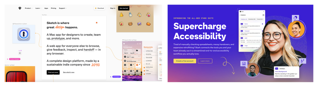
Sketch and Stark are two tools we use at Tower and can recommend for others.
5. Remember Why It Matters
Designing through the new lens of accessibility can be frustrating at times, especially when working within an existing brand’s color scheme. It can be easy to get excited about a bright and edgy design, but the bottom line is that websites need to be both usable and beautiful.
Viewing ADA compliance as a challenge, rather than as a roadblock, can keep things in perspective and strengthen your design skills along the way. Plus, it will make the web a friendlier and more accessible place for everyone when we use accessible color palettes.

At Tower, we work with many small businesses for whom individual customers are the prime focus, making visual accessibility, specifically accessible color palettes crucial for every site we build.
If you need to redesign or update your website to be ADA-compliant, our team of designers and developers is ready to help.
This blog was originally published on June 13, 2019. It was updated on July 6, 2023.
 Kelly P