With 50,000+ free and paid WordPress plugins available, it can be time-consuming and overwhelming to choose the best ones for your website. There’s a plugin for every need or problem, but this wealth of options can complicate your decision-making, especially if you don’t have web development experience.
If you’re asking yourself, “what are the best plugins for WordPress?” or “what WordPress plugins do I need?”, you’ve come to the right place. In this blog, we’ll review ten of the best WordPress plugins in alphabetical order, including their main features, cost(s), and pros and cons.
You can also use the index to the left (or above if you’re on mobile) to jump to any of the most popular WordPress plugins based on the capabilities you’re looking for.
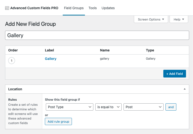
1. Advanced Custom Fields
This WordPress tool allows you to easily add extra content fields (known as Custom Fields) to your WordPress edit screens without writing any code. This means you can build your website more quickly, regardless of your theme template or web development skills. You can use Advanced Custom Fields (ACF) on any of the following WordPress edit screens:
- Attachments
- Categories
- Comments
- Custom Posts
- Custom Taxonomies
- Menus
- Options
- Pages
- Posts
- Taxonomies
- Users
- Widgets
Advanced Custom Fields comes standard with 30+ field types, and there are also hundreds of user-created fields available. These field types include basic, choice, content, jQuery, layout, and relational, among others. The plugin also provides PHP functions that developers can use to display stored field information in their front-end templates.
What It Costs
Advanced Custom Fields is a free plugin. However, there is also a paid version (ACF PRO) that includes five premium features: repeater field, gallery field, flexible content field, clone field, and options pages. You can find ACF PRO pricing below:
- ACF PRO Personal (1 website): $49/year
- ACF PRO Freelancer (10 websites): $149/year
- ACF PRO Agency (unlimited websites): $249/year
Pros & Cons
Advanced Custom Fields make it easy to create and manage custom fields for WordPress, making it one of the best WordPress plugins for blogs. However, it may require some web development knowledge to implement your custom fields into WordPress themes and plugins.
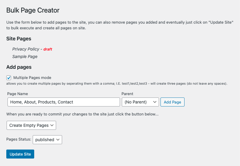
2. Bulk Page Creator
Bulk Page Creator allows you to generate multiple pages in bulk batches, which can save you time when you create your WordPress site. Once you’ve added all of your pages, you can create them with a click of a button. This plugin also offers backwards capability, which means the full length of the short description will be used and the markdown parsed if a section is missing.
What It Costs
Bulk Page Creator is a free, open-source plugin that you can download from the WordPress plugin library.
Pros & Cons
If you already know the structure of your new website, Bulk Page Creator is a great way to quickly generate all of your pages. However, you can only bulk create pages – not posts or custom post types. That means it’s more useful for setting up new sites with existing content than building out established ones.
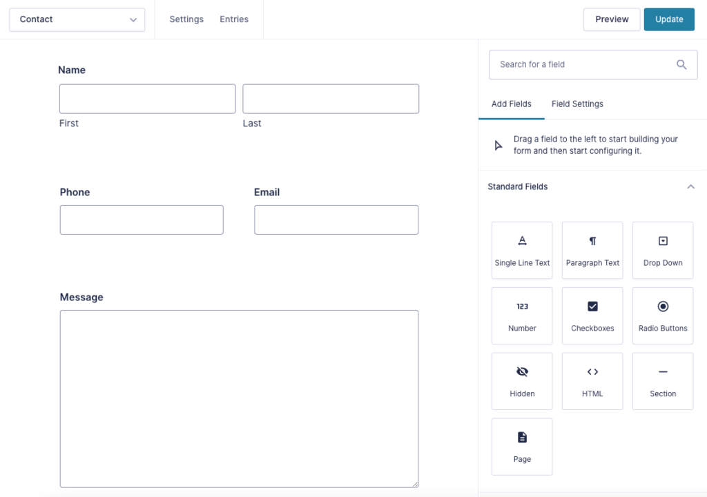
3. Gravity Forms
This plugin allows you to quickly create and build WordPress forms using an intuitive visual editor tool. You can easily select fields, configure options, and embed forms on your website to create a superior, streamlined user experience.
Gravity Forms comes standard with 30+ ready-to-use form fields, allowing you to create customized forms that facilitate your marketing goals. Plus, built-in conditional logic means you can configure your form to show or hide fields, sections, pages, and the “submit” button based on your needs.
Additional Gravity Forms features include:
- Advanced calculations
- Email autoresponders
- Entry limitations
- Form scheduling
- File upload fields
- reCAPTCHA, Really Simple CAPTCHA, and Akismet
- Responsive design
- Save partially-completed forms
- WordPress Post creation
Depending on the license you choose, Gravity Forms includes a variety of add-ons and integrations. These include ActiveCampaign, Constant Contact, HubSpot, Mailchimp, PayPal, Square, Zapier, and many more.
What It Costs
Gravity Forms is a paid plugin with three license tiers: Basic, Pro, and Elite. You can find pricing below:
- Basic License (1 website): $59/year
- Pro License (3 websites): $159/year
- Elite License (unlimited websites): $259/year
Pros & Cons
As one of the best WordPress form plugins, Gravity Forms offers easy form creation and is highly customizable to meet any need. However, it’s a paid plugin, and the Pro and Elite licenses offer many more useful features than the Basic one.
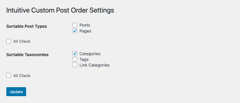
4. Intuitive Custom Post Order
Intuitive Custom Post Order allows you to arrange Custom Post Types, Custom Taxonomies, Pages, Posts, and Sites using drag-and-drop, sortable JavaScript. You can use the parameters included in your WordPress theme and override auto-converted parameters for additional customization.
What It Costs
Intuitive Custom Post Order is a free, open-source plugin that you can download from the WordPress plugin library.
Pros & Cons
One of the best free WordPress plugins, this tool is great for rearranging the order of your Pages and Posts, even if they’re customized. It also allows for custom sorting and is useful if you need to order items anachronistically. However, it’s important to realize that your designated order will remain the same even if you remove the plugin. And depending on your page build, Intuitive Custom Post Order may not be helpful since posts are naturally ordered by descending date.
5. Query Monitor
This essential WordPress plugin is geared towards web developers and allows you to inspect and debug many aspects of your website. These include database queries, PHP errors, theme template files, rewrite rules, and more. Query Monitor presents information in a logical, organized manner, allowing you to efficiently determine which plugins, themes, and functions are underperforming.
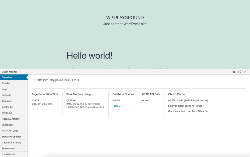
What It Costs
Query Monitor is a free, open-source plugin that you can download from the WordPress plugin library. It’s also included in some of the most popular WordPress platforms, including Altis and WordPress.com VIP.
Pros & Cons
This plugin is great for checking theme template file errors and inspecting and debugging your website. However, if you don’t have a web development background, you may need to consult a developer to fully utilize its capabilities.
6. Regenerate Thumbnails
Regenerate Thumbnails allows you to recreate all thumbnail sizes for any images you’ve uploaded to your WordPress Media Library. You can also delete old thumbnails to free up space on your server, making it one of the best WordPress gallery plugins. This plugin is particularly useful if you want to:
- Update the thumbnail size of past uploads
- Change the dimensions of existing thumbnails
- Update thumbnail sizes to match a new WordPress theme
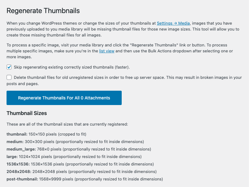
What It Costs
Regenerate Thumbnails is a free, open-source plugin that you can download from the WordPress plugin library.
Pros & Cons
This plugin is ideal for resizing images if you’ve changed the dimensions of the three default WordPress image sizes (thumbnail, medium, and large) in your Media Library settings. It’s also useful if you’ve created a custom image size after already uploading images. Plus, it can fix issues with image sizes, especially if new ones have been uploaded. However, it doesn’t work with WebP image formats or upscale images to fit sizes larger than the original.
7. Safe SVG
This plugin for your WordPress website allows you to safely upload scalable vector graphic (SVG) files to your Media Library. Safe SVG includes features like SVGO optimization, Gutenberg block compatibility, previous file upload scans, and restricted upload capabilities.
Scalable vector graphics are used to render two-dimensional images and are optimized for search engines, programmable, and capable of dynamic interactions. However, they’re also inherently insecure because they open your server up to XML-based attacks.
What It Costs
Safe SVG is a free, open-source plugin that you can download from the WordPress plugin library. There’s also a paid version (called WP SVG), but it’s currently unavailable from the third-party developer.
Pros & Cons
Another one of the best WordPress plugins, Safe SVG provides a secure, convenient way to upload SVGs to your Media Library and embed them via code. However, it hasn’t been tested in WordPress 5.5 yet, so it may be unsafe in newer versions until it’s updated by the developer. It’s also somewhat hampered by how WordPress incorporates SVGs and may be inaccessible to users who are unfamiliar with this file type.
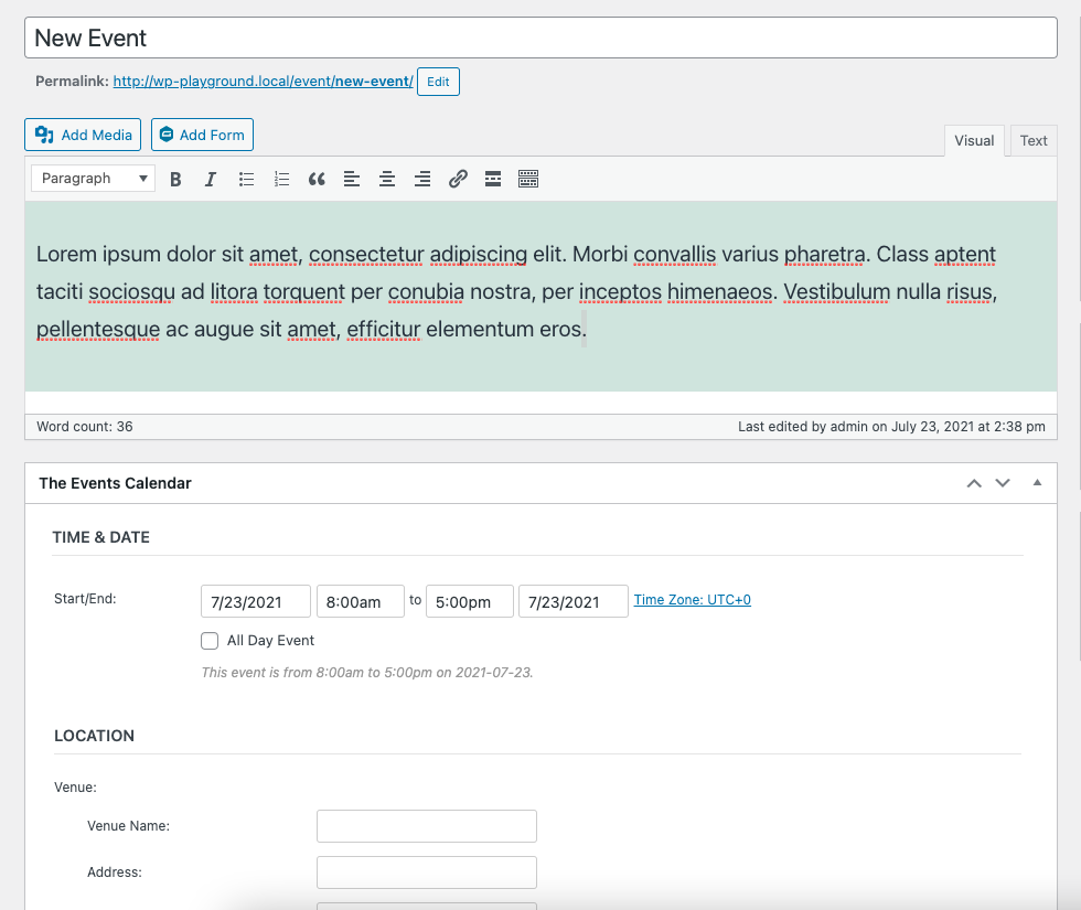
8. The Events Calendar
The Events Calendar allows you to manage your organization’s events in one place, making it one of the best calendar plugins for WordPress. You can share important dates with users while keeping details organized using categories and tags. It’s also fully responsive, developer-friendly, and designed for use on the go.
There are two versions of The Events Calendar: free and Pro. With the free version, you can choose from day, month, and list calendar views, all of which integrate seamlessly with your WordPress theme. You can also promote featured events to boost user engagement and attendance.
The Pro version offers all of the capabilities of the free one, along with the following additional features:
- Photo grid, map, week, and summary calendar views
- Monthly, weekly, and custom recurring events
- Shortcodes for easy embedding
- Advanced widgets
- Premium support
- Elementor integration
- Custom fields
- Location search
What It Costs
If you upgrade from the free version, The Events Calendar Pro costs $99/ year for one website.
Pros & Cons
While this WordPress tool makes it easy to manage and create or edit events, the free version is rather limited in comparison to The Events Calendar Pro.
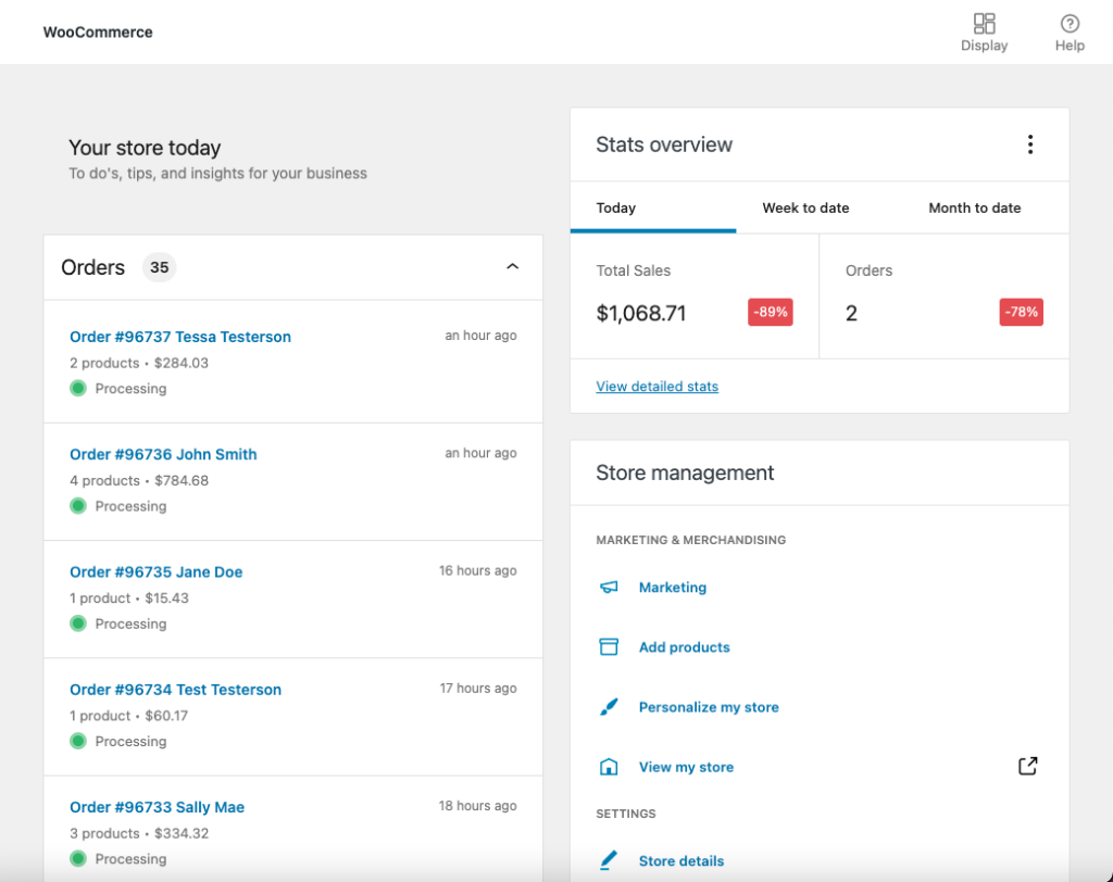
9. WooCommerce
With everything you need to start selling merchandise online, WooCommerce is WordPress’s premier eCommerce plugin. It’s developer-friendly and built with a REST API, and you can add extensions from the WooCommerce Marketplace to extend your store’s functionality. These range from customer relationship management and product types to shipping and subscriptions, among many others.
WooCommerce allows you to customize your homepage, site structure, menus, and payment and shipping options. Plus, it comes bundled with the ability to accept major credit cards, bank transfers, checks, and cash on delivery. Best of all, there are no fees on transactions beyond that of the payment service provider, making it the most affordable way to sell your products online.
You can also take advantage of WooCommerce Payments, WooCommerce Marketing, and WooCommerce Shipping, all of which help make it the best eCommerce plugin for WordPress.
What It Costs
WooCommerce is a free plugin that you can download from the WordPress plugin library. Some of the extensions you may choose to add cost extra, though.
Pros & Cons
Because it’s a free plugin, WooCommerce is very popular among users who are new to eCommerce. However, it’s important to understand that it requires additional plugins for enhanced functionality, which often vary in cost and quality.
10. Wordfence Premium
Wordfence Premium is an endpoint firewall and malware scanner plugin that’s specifically designed for WordPress. It pairs a firewall and security scanner and is armed with the newest firewall rules, malicious IP addresses, and malware signatures. Because it runs at the endpoint (your server), Wordfence Premium provides superior protection than cloud alternatives.
This plugin also includes the following standard features:
- Two-factor authentication (2FA)
- Source code verification
- Country blocking
- Malicious network blocking
- Live traffic monitoring
- Leaked password protection

What It Costs
Wordfence Premium is a paid plugin that costs $99/year for one license. However, there are percentage discounts available if you purchase additional licenses or extend your license span.
Pros & Cons
Arguably the best WordPress security plugin, Wordfence Premium is customized to protect your WordPress website. However, it costs money and requires knowledge to properly secure your WordPress installation.
The smartest way to select the best WordPress plugins for your website is by partnering with a digital marketing agency like Tower Marketing. Contact us today and connect with our web developers to outfit your WordPress website with the right plugins.