0

This post was originally published in October 2016. It was updated in November 2019.

Eight seconds. A website user’s attention span lies somewhere around eight seconds. In the time it’s taken you to read these opening lines, you’ve probably picked up your phone at least twice, were distracted by something in your peripheral vision, or started mentally making a to-do list.

There’s a lot of competition for users’ attention online (and offline), so here are a few ways you can fight against short attention spans and entice users to stay on your website for longer than a goldfish can concentrate on something (which, for the record, is nine seconds).

Shorter Attention Leads to Higher Bounce Rates

Bounce rates reflect whether your website visitors click through to the second page of your site, or if they leave after viewing just a single page. These are called single interaction visits. They can often be a sign that your website is too difficult to use, information is not easily found, or the information within is uninteresting/unappealing to your users.

Average bounce rates can vary between 20 – 90% depending on the type of website you operate or even the type of page users are viewing. The chart below, created by Conversion XL, shows that eCommerce websites average a 20 – 45% bounce rate, while blogs and special landing pages average a bounce rate of 60 – 90%.

bar graph showing bounce rate of different types of websites

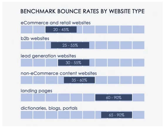
Online shoppers typically spend a longer average time on a website as they browse multiple products.  However, blog posts or landing pages can have a considerably higher bounce rate, especially if they are not designed, written, or formatted to grab visitors’ attention.

But, also consider that a high bounce rate doesn’t always mean your website is in trouble. A visitor looking for your address or telephone number can quickly visit a locations page, contact page, or even the homepage and find the information they need very quickly. While it may result in an average bounce rate of 70-90%, it also results in satisfied users.

How to Keep Visitors on Your Site Longer

The Faster the Better

The very first way you can lose a website user’s attention is by keeping him or her waiting.  The speed at which your site loads can make or break you in terms of keeping a user on your site. And users have the need for speed.

You can test a page’s load speed by using Google PageSpeed Insights or Varvy. If your results come in higher than user expectations, you may want to pay attention to the following elements of your site:

  • Reduce server response times
  • Condense images and media
  • Prioritize visible content
  • Enable browser caching
  • Optimize CSS, HTML, and JavaScript
  • Minimize redirects

Know Their Habits

One of the best ways to keep web users’ attention is to build your site and present your content to mirror the way they read (or, more than likely, skim) through your site. There’s no shortage of research on how people interact with websites, but here are some of the highlights we pulled to help you harness your readers’ attention.

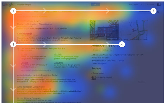
Readers Follow An F-Pattern

When researchers conducted an eye-tracking study, looking at how users viewed thousands of web pages, a dominant reading pattern emerged. The F-shaped pattern showed that readers typically scan three main areas of a web page.

  • A horizontal movement along the top of your content area.
  • A second, but shorter, horizontal movement further down the page.
  • A vertical movement, which researchers called a “slow and systematic scan” down the left side of the content.
example of f-pattern website tracking

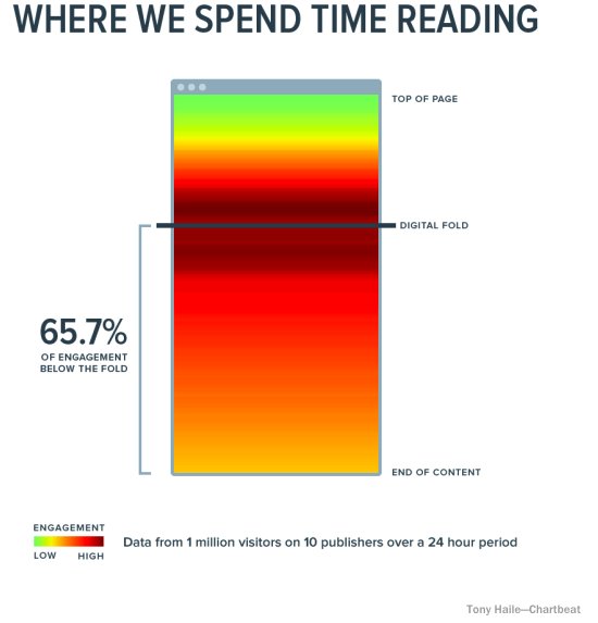
They Go Beyond the “Digital Fold”

Because of a website user’s short attention span, marketers often feel they need to cram as much information as possible into the top part of their website, which is often referred to as “above the fold.”  And yes, it is important to provide key information to your readers as quickly as you can, but the main point here is “key,” not “all.” Smart web users know they need to scroll down a web page, and they will happily do it. In fact, analysis from over a billion web visits shows that 66% of attention on a normal media page is spent “below the fold.”

website users read below the fold

Users also know that the call-to-action and suggested next steps are found at the bottom of the page, which is why the bottom is the second most-viewed section of a web page. Give them what they’re looking for with a strong call-to-action to round out each web page.

Engage With Video Content

There are many good reasons to incorporate video into your website. Video allows you to tell the stories that help users learn about and trust your brand. Video also provides users with short attention spans with an option beyond reading through pages of long-form content. Videos are quick and colorful and keep users engaged longer.

Don’t be intimidated by video. Not everything you create needs to be splashy, high-production content.  Here are a few ideas for video content to include on your website:

  • Homepage video
  • Product demonstrations
  • How-to videos
  • Brand story/history video
  • Client testimonials
  • User-generated video

Grab Visitors’ Attention with a Friendly Reminder

How many browser tabs do you have open right now? Is the article you started reading with your morning coffee still there? You may have already forgotten why you went to those sites in the first place. A multi-tasking audience with a short attention span can be hard to overcome, but we discovered a fun way to make your site’s browser tab stand out from the rest and encourage visitors to return to their session.  Just take a look at these two browser screen grabs…

Snip20161018 6 Winning the Fight Against a Website User's Attention Span
Snip20161018 9 Winning the Fight Against a Website User's Attention Span

Did you catch the difference?  The “Thoughts on Users” tab changed to “Don’t Forget to Read This…” when I clicked over to another tab.  A small touch, sure, but in that eight-second span, it may be just enough to bring back an attention-challenged user.

P.S.

I’ve hidden eighteen typos in this post to ensure that you were paying attention. Just kidding, I didn’t.

If you need help creating the written, visual, or video content that grabs visitors’ attention, contact our digital marketing specialists!

Don’t have time to read this blog? Listen to the audio version while on-the-go!

A new website can be a crowning achievement for your marketing team and all eyes throughout your company will be on the final product. You’ve worked through sitemaps, wireframes, page layouts, and content.  But now is the moment you’ve been waiting for. The website testing phase is your first opportunity to see your website (almost) live and in action on the screen!

However, testing a website is a huge undertaking. Of course, you’re looking at each page to ensure it matches the approved designs, getting a feel for the load speed, and experiencing the final user experience first-hand. There’s more to the website testing phase, though than a quick browse through each page of the site. With much back and forth, a typical testing phase can take about a month total. But as the saying goes, all in good time!

For a successful test phase and a fantastic end product, we’re breaking down everything you should be giving attention to when testing a website.

1. Cross-Browser Testing

No two users will browse your site under the same set of circumstances. One visitor will be using Safari on the iPad, another will be using Chrome on an Android phone, and there may even be a visitor using IE8 on a desktop computer (shudder!). And, it’s probably safe to assume that the majority of users are not using the latest and greatest browser version, although our developers would love it if this were the case.

With older browser versions, aspects and functionality of your new website may not translate perfectly. Cross browser testing, or reviewing your website across several browser platforms, allows you to catch any browser incompatibilities before your site goes live.

The most popular browsers that you should use when testing a website include:

  • Google Chrome
  • Safari
  • Firefox
  • Microsoft Edge
  • Internet Explorer

And you should also test these browsers using devices with different operating systems and from different manufacturers (iOS, Android, Apple, Samsung, Google).

If you haven’t already, dig into your Google Analytics which can offer insight into the browsers and devices that your visitors are using most often when they come to your site. This will give you a good starting point for your cross-browser testing.

These are some of the more common browser “bugs” that you want to look for as you explore your website on different online browsers.

  • Safari generally uses font smoothing which causes certain fonts to look lighter or thinner as opposed to other browsers.
  • Older versions of Internet Explorer don’t support certain modern attributes which can cause breaking layouts or animations that fire off incorrectly.
  • Forms are generally the greatest offender for cross-browser testing. Dropdowns, input fields, even submit buttons are all masked differently by each browser.
  • Audio and video formatting is also very important. You may that some browsers don’t support your video files and they won’t play properly.
  • Scrolling may be different from browser to browser. If your site includes Scroll Magic or any Parallax scrolling, it is important to make sure it is smooth across all browsers.

2. Testing a Responsive Website

This step of the website testing phase has become more crucial as responsive web design has taken over web development and design. Responsive testing hones in how on the design adapts for different screen sizes. During this phase, we look for aspects of the page layout that are off-center, cut-off, overlapping, or missing altogether.  Websites should be tested on a desktop, laptop, tablet, and mobile device at a minimum.

Here are two ways you can easily test that your website design and content adapt appropriately for all screen sizes.

Use Actual Mobile Devices

When you receive the test site from your development team, you’ll probably sit down and start testing on your desktop or laptop. But, to get a true picture of how your website will perform on smaller screens, your best bet is to use these actual devices. So tell your team to gather their Surface Pros, iPad Minis, Samsung Galaxys, and iPhones (new and old!) and give your test site a thorough review, noting any issue they encounter.

Virtual Machining

If you don’t have access to a number of different devices, you can turn your desktop into a “virtual machine” that allows you to view your website as it would look on a variety of popular mobile devices. Follow these steps:

  • View your website using Chrome browser
  • From any page, right click your mouse and choose Inspect
  • In the top left menu, click the Devices icon (it looks like a tablet and phone side-by-side)
Screenshot of turning on Virtual Machine for Website Testing
  • Use the drop-down menu to choose a mobile device
Screen shot of Choosing a Mobile Device Size in Virtual Machine

When reviewing your new website for responsiveness, here is a list of what you should be on the lookout for:

  • A common responsive issue affects subheader navigation items. For example, if you hover to get to the subheader on a desktop or laptop, you may find that certain mobile devices will not recognize the hover and instead users will be stuck clicking on and transferring to the parent page.
  • Overlapping layouts can occur.  As newer phone models are introduced and their breakpoints are different than what the developer designed for.
  • Image cropping can also occur since viewports need to be decreased for mobile devices. Background images can be aligned top, left, right, center, but some cropping may still occur.
  • Make sure your content is comfortably readable. The font sizes should decrease on your mobile device for better readability. 
  • You may find some pages become much longer when viewed on mobile devices. Make sure your design includes a simple “back-to-top” arrow or a sticky hamburger icon to help with this issue.

3. Testing User Accessibility

Currently, there are over 57 million Americans living with disabilities, including visual, hearing, motor, and cognitive disabilities. Over one million individuals report that their disability makes it challenging to browse the web.

Certain elements make it difficult or impossible for those living with disabilities to use a site. In many cases, these individual are using special tools (screen readers) or alternative methods (using a keyboard instead of a mouse) for navigating and interacting with your website. When building a new website you need to be sure your website is accessible to all users and provides everyone the same web experience.

When testing a new website, your development will use an online tool to “grade” your site’s user accessibility. It will look for errors that include:

  • Improper hierarchy of heading tags (H1, H2, H3)
  • Links or buttons that don’t include text or text that is not specific enough
  • Images that are missing alt text
  • Issues with tab navigation (using the tab button to navigate between links)
  • Missing form labels
  • Color contrast that could be hard to read

There won’t be much additional testing that you need to do, but it recommended that you run a report on your site at least twice a year to ensure that no new errors have developed.

4. eCommerce Testing

Testing an eCommerce website requires a few more steps because you need to make sure your website can properly support all shopping scenarios.  In addition to the testing methods outlined above, there are additional tests you should run before launching a new eCommerce website.

  • Adding new categories, sub-categories, products, and product variations (size, color, material) to the website
  • Adding different types of products to the site (product bundles, virtual products, downloadable products)
  • Placing an order
  • Canceling an order
  • Confirming proper sales tax and shipping costs
  • Ordering multiple products
  • Testing discount codes
    • use a discount code for eligible products
    • use a discount code for ineligible products
    • use a discount code with an appropriate order amount
    • use a discount code when the order amount is too low
  • Setting up a user account
  • Setting up special user groups (users who receive special pricing or users who can only access certain products)

5. Attempting to Break the Site

As a final step of the website testing phase, we always tell clients to try to “break the site.” Our theory behind this request is that if we can break the site during testing, then a user will be less likely to stumble upon an area that is broken once it launches.  It may be time-consuming, but it’s necessary to visit each page of your website and take the following actions:

  • Test all links (throughout the navigation, footer, sidebars and body copy) to ensure they go to the correct page
  • Make sure all videos play correctly
  • Complete and submit all forms and ensure they go to the proper person or email system
  • Test any downloads
  • Sign-up for any email subscriptions or lead generators and make sure your information is populated to the correct mailing list
  • Test any third-party plug-ins to ensure they work properly with the new site

Is there a key part of the website testing phase that we’re missing? What’s the first thing you look at when testing a new website?

First Things First

Before we dig into how Google obtains website metrics to assess quality, it should be stated that small businesses must regularly track user engagement metrics on their websites. This should include evaluating the quality of the organic search traffic (SEO) the site is receiving. Increased website engagement will result in increased conversion rates and ROI.

User Interaction on Your Website

Assessing a user’s behavior on a website will offer strong insight as to their goals.

  1. A user lands on a site.
  2. They visit seven pages.
  3. They find a product they want.
  4. They add the product to the shopping cart.
  5. They purchase the item.

It is clear from this example that the user found what they were searching for on the website. Now, compare this with a visitor who lands on a web page and hits the browser’s “back button” in less than a few seconds. Who had the better user experience? Who engaged with the site more?

The above are examples of user engagement signals that search engines are using as data points in their algorithms to assess the quality of a site. These signals are not easily understood by the likes of Google. Search engines are private about their algorithm information because this is what separates them from the competition.

We have learned that user engagement signals are valuable in calculating search quality and may also be used as ranking signals. When a user lands on a page that does not match what they searched for, this will more than likely result in poor engagement.

If your company has a website, poor user experience is something you want to reduce and keep to an absolute minimum.

How Google Collects User Engagement Metrics

Google has a huge quantity of data sources available to them. Some of the most important ones are as follows.

SERPS (Search Engine Results Pages)

How a user interacts with the listed search results is a fundamental source of data. For example, if a user does a search in Google and decides not to click on the first or second result, but instead clicks on the third option, that can act as a signal to Google that the third result might actually be the best result for that query.

In the future, Google may adjust the ranking position of the result that was originally in third place.

Google Analytics Data

If you have Google Analytics tracking on your site, Google is able to learn how users interact with your site. This information is used by Google to learn trends and many more search abhors of users. Google Analytics can also be used to help your company improve its site so you target the right audience.

Mobile Operating Systems

With Google entering the mobile market, it’s changing how people interact with the web. Google’s Android mobile phone operating system is the most used operating system on mobile devices in the world, with more than 50% market share.

Android connects people to Google Maps, Search, and Images, impacting how a user finds and interacts with your site. Having a website that is mobile friendly and responsive is not a choice anymore.

Every business website should have these mobile features included.

Different Browsers

Browsers are influential data sources since they can monitor every action taken by a user. Microsoft’s Internet Explorer used to have the major market share back in early 2011. That all changed as Firefox and Google Chrome became more predominant.

Display Advertising

Google AdSense offers websites the ability to place ads on their sites and earn revenue when users click on them. This click data is something that helps Google understand how users interact with the site.

Toolbars

Users who install the Google Toolbar in their browsers help search engines better understand how a user navigates the web. These toolbars provide users with a lot of accessibility that can offer a better online search experience.

Goo.gl URL Shortner

There are many URL shorteners such as Bit.ly and Ow.ly. Google created a URL shortener of its own called Goo.gl. A URL shortener allows Google visibility into sharing content, even in social networks where it does not otherwise have access (for example, private Facebook pages.)

Different Forms of Online Voting

There is another set of signals that search engines measure, which we call voting mechanisms. These voting mechanisms are methods by which users directly indicate their approval or disapproval of content, services, or products. Here are some examples:

Facebook Likes

We are all familiar with Facebook’s like feature, which indicates content we like on the web. Ultimately, search engines can see what content is “liked” and gives that content more value.

Reviews

Reviews allow users to express appreciation or frustration with a product or service. Google takes these very seriously, as they are personal and inform other users.

Google is able to measure the amount of positive or negative comments to ascertain whether a website is providing quality to the user. Reviews are especially impactful when it comes to optimizing your site for local search.

Brand Name Searches

Another signal of importance is a large number of brand name searches. For example, brands like Nike and Amazon have searched hundreds of thousands of times per month.

This causes them to show up more often in results to generic search queries like athletic shoes or fiction books over lesser-known brands.

User Engagement Signals That Could Affect Rankings

Google has an in-depth collection of data sources that allow it to quantify a wide range of online user behaviors. Mentioned below are some of the major signals that Google can extract (and that you can extract, too, by looking into Google Analytics):

Bounce Rate

Bounce rate measures the percentage of users who visit only one page on a website and then leave. Bounce rate can also define the interaction of the user with the search results.

For example, if a user clicks on a search result, then returns to the SERPs and clicks on another result, that could be an indicator that the first result was not a good response for that search query.

Generating New Searches

A user may observe a set of search results, then come back to the search engine and modify his search query to better refine the results.

Click-Through Rate (CTR)

Google measures the click-through rate on links presented in the SERPs, on web pages in URL shorteners, on RSS feed readers, PDFs, and more. Many SEOs believe that CTR is actually a ranking factor when applying SEO best practices.

Time on Page

Google can measure the amount of time spent on a given page. Time on page could be considered a signal of higher quality pages(for example, the user spent time reading the whole article.)

Time on Site

Similarly, time spent on a website, as a total, is considered a positive signal. If the average user spends more time on your site than on the sites of your competitors, that might signify your site is of higher quality and relevance.

Pages per Visit

More pages viewed by a user on your site suggests greater user engagement. Viewing more pages usually signifies interest and that is something Google considers important.